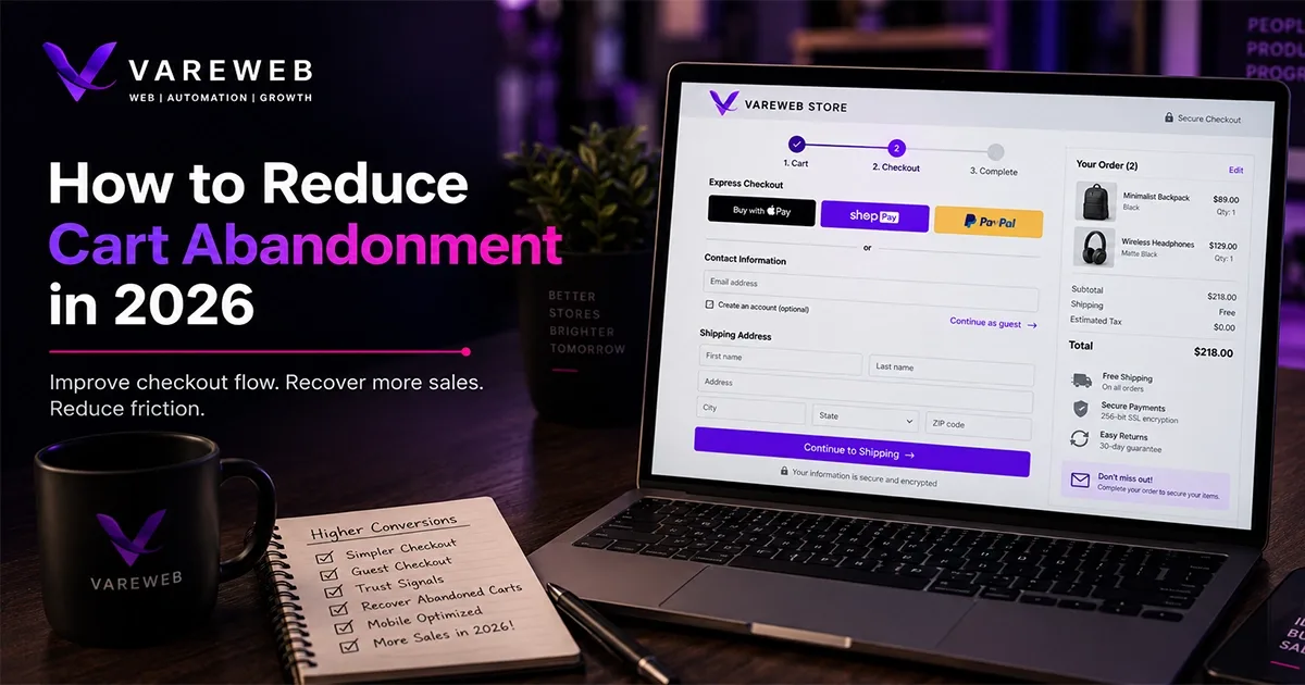
Quick Answer: The average cart abandonment rate has remained close to 70% for years, despite continued investment in checkout optimization. Reducing cart abandonment in 2026 is less about finding one major fix and more about removing common points of friction, including unexpected costs, forced account creation, slow or complicated checkout flows, poor mobile usability, and payment steps that do not inspire confidence. The most effective strategy combines two approaches: preventing abandonment through better design and pricing transparency, and recovering abandoned carts through well-timed follow-up.
I've pulled this report for enough stores to know what the abandonment funnel usually hides. Store owners open Shopify or GA4, see a number somewhere north of 70%, and treat it as one problem to solve. It isn't. The number that matters isn't the abandonment rate - it's where in the funnel people are dropping, and why.
The benchmark itself is well established. Baymard Institute's meta-analysis of 50 independent studies puts the average online shopping cart abandonment rate at 70.22% - and that figure has stayed within a percentage point or two of roughly 70% for over a decade, across a period that saw checkout UX get redesigned industry-wide multiple times over. Some sources report broader averages closer to 74-78% depending on methodology and time window; the range matters more than any single false-precision number. What every dataset agrees on: this isn't a problem you solve once. It's a funnel you manage continuously, the same way Shopify Development Services treats checkout as an ongoing build concern rather than a one-time setup task.
Treating abandonment as two separate problems is the shift that actually changes outcomes. Preventable abandonment is friction you created - hidden costs, forced accounts, slow forms, no trusted payment options, a checkout that buckles on mobile. Recoverable abandonment is shoppers who left for reasons outside full control - comparison shopping, not ready to buy, waiting for payday - who can be brought back through timed, non-annoying follow-up. Most guides treat email recovery as the primary fix. It isn't. It's the safety net, not the foundation.
What the 2026 Data Actually Shows
Before the tactics, the numbers worth anchoring to. This is the quick-reference version - the reasoning behind each row is covered in its matching section below.
|
Reason for abandonment |
Share citing it |
Addressed in |
|
Just browsing, not ready to buy |
42% |
Category 2 - Recovery |
|
Extra costs too high (shipping, tax, fees) |
40% |
Fix the Cost-Surprise Problem |
|
Delivery too slow |
20% |
Fix the Cost-Surprise Problem |
|
Didn't trust the site with card info |
19% |
Build Visible Trust |
|
Forced account creation |
18% |
Fix Forced Account Creation |
|
Checkout too long or complicated |
17% |
Shorten the Checkout Form |
|
Site errors or crashes |
17% |
Fix Technical Errors |
|
Unsatisfactory returns policy |
13% |
Build Visible Trust |
|
Couldn't see total cost upfront |
12% |
Fix the Cost-Surprise Problem |
|
Insufficient payment methods |
9% |
Diversify Payment Options |
Source: Baymard Institute's checkout usability research, survey of US online shoppers. Shares don't sum to 100% because respondents could select multiple reasons.
Where Exactly Is Your Funnel Leaking?
A blended abandonment number hides the real story - which device, which traffic source, which step. Vareweb reviews your funnel stage by stage to find the specific friction costing you sales, not just the industry average.
A few other figures worth having in view: mobile abandonment consistently runs meaningfully higher than desktop - commonly cited in the high-70s to mid-80s percent range versus roughly the mid-60s to high-60s on desktop, a persistent gap tied to smaller screens and harder data entry. Industry variance is large too - luxury, fashion, and travel sit well above the average, while grocery and pet care sit well below it. And the headline number has been essentially flat for over a decade. That last point matters most: this is a funnel-management problem, not a solvable-once problem.
Category 1: Prevent the Abandonment You're Causing
Everything in this category is design and pricing work, not persuasion. What I check first is whether the shipping cost is a surprise or a known quantity - because that single detail decides more outcomes than any other line item on this list.
Fix the Cost-Surprise Problem (Addresses ~40% of Abandonment)
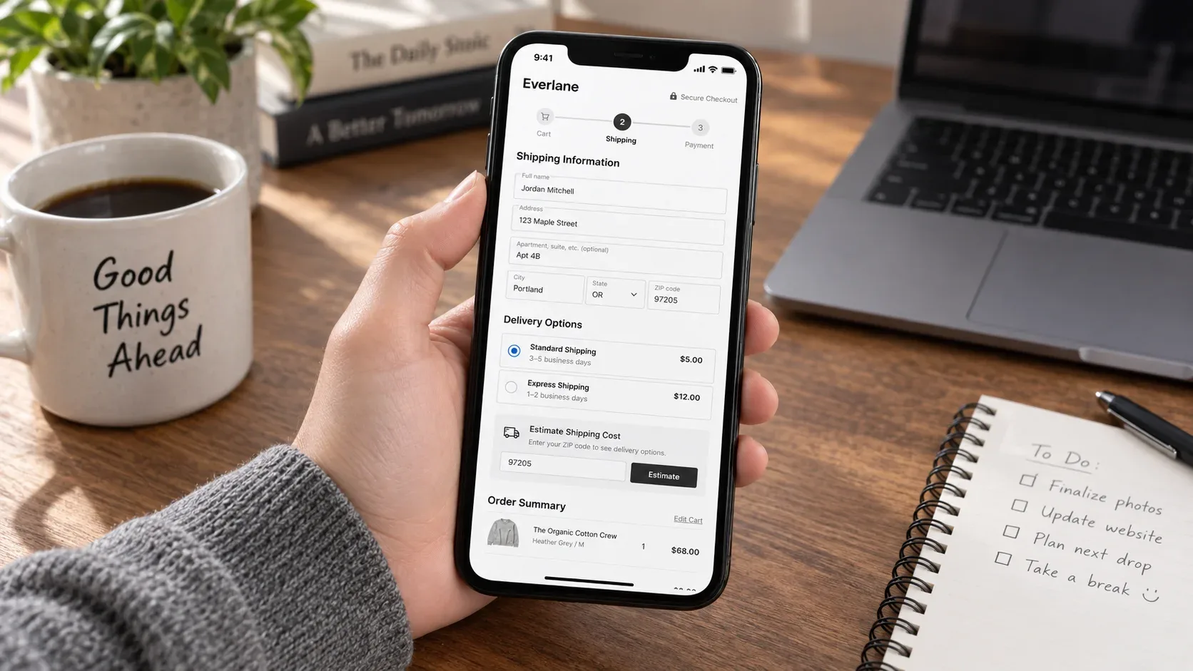
"Calculated at checkout" is the phrase that kills more sales than any competitor ever will. Show shipping estimates on the product page or early in the cart, not first at final checkout. Display a running total including estimated tax and shipping before the checkout flow even begins. Use a visible free-shipping threshold nudge - "Add $12 more for free shipping" - rather than a static banner nobody reads twice.
For lower-cost items, consider baking shipping into the listed price. Shoppers react to the presence of a fee more than the total amount, even when the math is identical - I've seen this tested head to head enough times to trust it as a pattern, not a coincidence. For international orders, show duties and taxes upfront where legally required; a surprise customs bill damages repeat-purchase likelihood even when it doesn't kill the original sale. The same transparency logic applies to how you present any price on the site - I've covered the broader principle in How to Design Pricing Pages That Actually Convert.
Cost Surprises Are Costing You ~40% of Your Carts
Showing shipping and total cost early takes real changes to your product, cart, and checkout templates - not a banner. Vareweb builds that transparency directly into the storefront.
Fix Forced Account Creation (Addresses ~18-26% of Abandonment)
Make guest checkout the default path, not an option buried under a login form. A guest checkout option that's buried below the login form doesn't count as guest checkout. Offer a one-click "save your details" prompt after purchase completion instead, when purchase anxiety is gone and opt-in rates are meaningfully higher than when it's demanded up front.
This isn't always the default, and it's platform-specific to get right. On Shopify, it lives under Settings > Checkout, in the customer sign-in requirement - requiring sign-in also hides accelerated checkout buttons like Apple Pay, which compounds the friction. On WooCommerce, it's the Accounts & Privacy settings under WooCommerce > Settings, where guest checkout has to be explicitly enabled rather than assumed. If you're building or auditing either platform's checkout from scratch, this is exactly the kind of setting WooCommerce Website Development Services Built Without the Bloat That Usually Ships With Them gets configured correctly the first time instead of discovered months later in a funnel report.
Shorten and Simplify the Checkout Form (Addresses ~17% of Abandonment)
Remove every field not required for fulfillment - skip the phone number if email covers tracking, drop company name and other fax-era fields nobody needs anymore. Combine billing and shipping address behind a "same as shipping" checkbox, checked by default. Baymard's own benchmark data is blunt about the gap here: the average checkout displays 23.48 form elements, while a genuinely well-designed one needs as few as 12-14.
Add a visible step indicator - "Step 2 of 3" - which reduces perceived effort and anxiety even when the actual field count hasn't changed. Use inline validation that flags errors as the shopper types, not after form submission, and support autofill and address lookup wherever the platform allows it. Checkout is still a form, and the same principles that make any form easier to finish apply directly - I go deeper on the mechanics in How to Design Forms That Get Completed.
Treat Mobile as the Primary Checkout, Not an Afterthought
Mobile abandonment runs meaningfully higher than desktop across every dataset that splits by device, tied to smaller screens and harder data entry. That gap alone justifies mobile-first checkout design rather than mobile-adapted design - a distinction that matters more than it sounds like it should. I've seen stores where mobile abandonment sits at 80%+ while desktop is closer to 65%, on the exact same product catalog and pricing.
Prioritize large tap targets, native autofill, and prominent express-payment buttons above the fold on mobile checkout specifically, not just on the homepage. Test actual load time on a mid-tier Android device, not just a flagship iPhone on office wifi - checkout speed under roughly two to three seconds correlates with materially lower abandonment. The layout and interaction decisions that drive this are the same ones covered in Mobile-Friendly Design Best Practices for Improving Conversions and Better UX and How Important Is Page Speed for SEO in 2026?, and both apply just as directly to checkout as they do to the rest of the site.
Is Your Checkout Actually Built Mobile-First?
Mobile abandonment running well above desktop usually means checkout was adapted for mobile, not designed for it. Vareweb builds checkout mobile-first from the start - large tap targets, native autofill, express payment above the fold.
Diversify Payment Options
Offer major card networks plus at least one digital wallet - Apple Pay, Google Pay - and one buy now, pay later option where average order value supports it. BNPL availability reports measurable conversion lifts for brands that use it, though results vary meaningfully by audience and price point; don't treat it as a universal fix.
Localize payment methods for international markets. A missing, regionally preferred payment method is a silent, hard-to-diagnose abandonment cause - nobody files a support ticket saying "you don't accept my payment method," they just leave. This is one area where platform choice genuinely shapes what's easy versus what needs custom work; I've covered the practical difference between the two ecosystems in Shopify vs WooCommerce in 2026: A Practical Decision Framework.
Build Visible Trust at the Payment Step (Addresses ~19% Security Concerns)
Show recognizable payment logos and security indicators at the exact point of card entry, not just in the footer where nobody's looking at the moment it matters. Surface your return policy near the buy button, not buried on a separate page - a one-line "Free returns within 30 days" answers post-purchase-regret hesitation before it gets asked. The mechanics of why this specific placement works are worth understanding directly; I've written more on what trust badges actually mean and why they matter at this exact point in the funnel.
Keep review counts and star ratings visible through the cart and checkout steps where the platform allows it, reinforcing social proof at the moment of highest hesitation rather than only on the product page where the decision hasn't been made yet. The same principle - proof at the point of doubt, not just earlier in the journey - is covered more broadly in 12 Reasons Why Social Proof Is Important for Your Brand.
Fix Technical Errors and Site Reliability (Addresses ~17% of Abandonment)
Site errors and crashes during checkout account for a meaningful share of abandonment entirely on their own, and this is a QA and monitoring problem, not a persuasion problem - no amount of trust badges fixes a payment form that silently fails to submit. Regularly test checkout on real devices and real payment methods, not just a staging environment with test cards that never surface the failure modes real traffic does.
Monitor for payment-gateway timeouts specifically, which often go unnoticed until refund and support tickets spike well after the fact. Technical reliability at checkout is a narrower version of the same site-health discipline that shows up in broader technical audits - I go through the platform-specific failure patterns in Common Shopify SEO Issues and How to Fix Them, and a lot of the same monitoring habits apply directly to checkout reliability.
Checkout Errors Are a QA Problem, Not a Persuasion Problem
No amount of trust badges fixes a payment form that silently fails. Vareweb tests and monitors checkout on real devices and real payment methods across Shopify and WooCommerce builds.
Category 2: Recover the Abandonment You Couldn't Prevent
Understand What "Just Browsing" Actually Means
42% citing "just browsing, not ready to buy" doesn't mean these carts are worthless - it means timing, not design, is the obstacle. No checkout redesign fixes browsing behavior, and treating this segment as a design failure wastes effort that belongs elsewhere. This is the segment where timed remarketing, not urgency panic, does the most good.
Build a Structured Recovery Sequence
From experience, discount-first recovery emails train your best customers to abandon on purpose. A better sequence holds the discount back rather than leading with it:
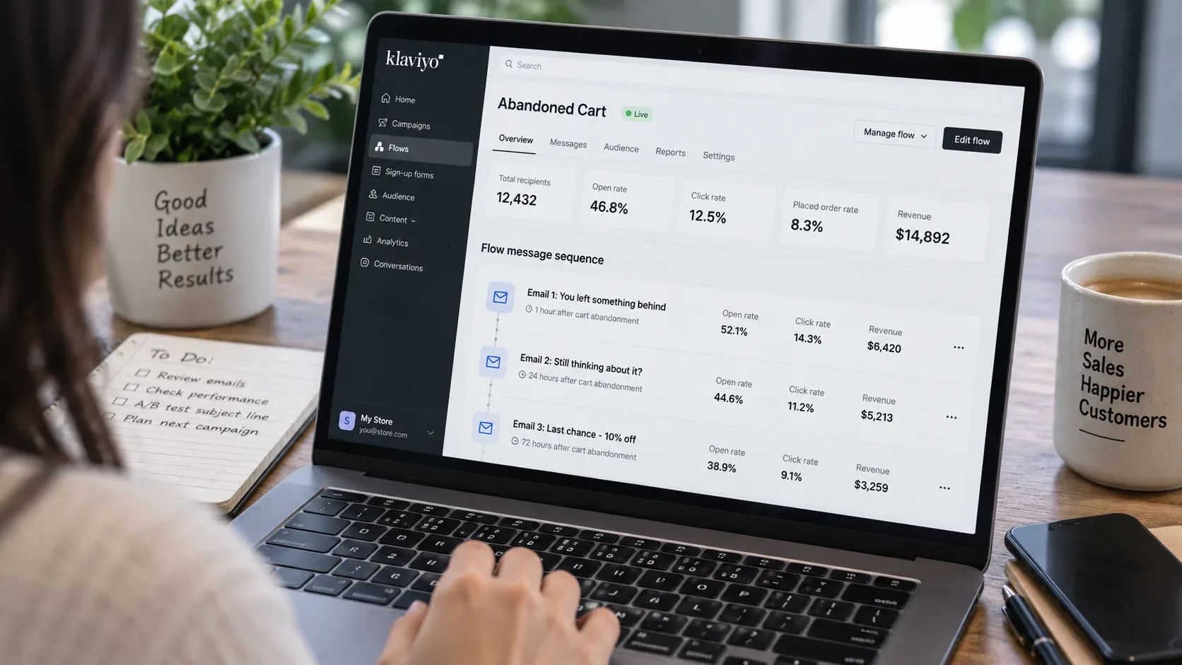
- The reminder (within 1 hour): No discount. Just the product, an image, and a direct link back to the cart. Many abandoners were simply interrupted, not undecided.
- The objection-handler (around 24 hours): Address the likely stall point directly - shipping cost, return policy, sizing or fit - using content, not pressure.
- The incentive (48-72 hours, used selectively): Hold any discount to the final message. Leading with one trains repeat customers to abandon deliberately just to trigger it.
Use SMS and Multi-Channel Recovery Where Appropriate
Some data shows SMS recovery outperforming email on engagement and completed-purchase rate, though absolute figures vary widely by source and audience - treat any specific recovery-rate percentage as directional, not universal. The consent requirement is not optional framing: SMS marketing requires explicit opt-in and is subject to regional regulation - in the US, the Telephone Consumer Protection Act governs this directly, and equivalent rules apply elsewhere. This isn't a free upgrade over email; it's a different channel with real compliance overhead attached.
Retargeting ads and exit-intent offers work well as complementary channels alongside the email and SMS sequence, not as replacements for it. And the discipline behind any of this only compounds if the follow-up itself is well-timed and genuinely useful rather than reflexive - the same reasoning behind why automated follow-up matters more in 2026 than it did even a couple of years ago.
Don't Over-Rely on Urgency Tactics
Manufactured urgency - "Only 3 left!" - can lift short-term conversion, and it damages trust the moment the claim isn't genuinely true. Repeat customers notice when "limited stock" reappears every week on the same product. Use urgency when it's real. Skip it when it isn't, even if the short-term number looks tempting.
How to Measure Whether Your Fixes Are Working
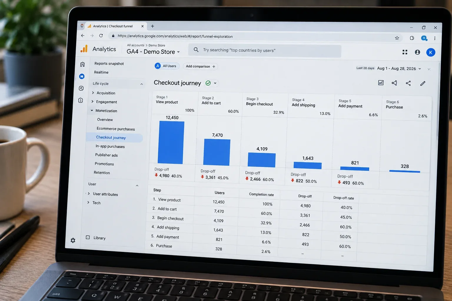
Track the funnel in stages, not as one blended rate. Add-to-cart to begin-checkout, and begin-checkout to completed-purchase, are different problems with different fixes - collapsing them into a single abandonment percentage hides exactly the information you need to act on.
- Segment abandonment rate by device before drawing conclusions - a store-wide average can hide a mobile-specific problem entirely.
- Segment by traffic source too. Abandoned carts from cold ad traffic behave differently than abandoned carts from returning-customer email clicks.
- A/B test one variable at a time - guest checkout default versus account-first, for example - rather than redesigning checkout wholesale and guessing which change actually mattered.
- Track recovery-email performance separately from prevention improvements. A good recovery sequence can mask a checkout problem that's still quietly costing you first-time completions.
What a Realistic Target Looks Like
Going from roughly 70-76% abandonment to zero is not a realistic goal, and treating it as one sets up every optimization effort to feel like a failure. A portion of abandonment is healthy comparison-shopping and browsing behavior that exists in every industry, on every platform, regardless of how good the checkout is.
Success looks like reducing preventable abandonment - cost surprises, forced accounts, technical errors, checkout length - meaningfully, while running a disciplined, non-discount-led recovery sequence for the rest. Whoever builds and maintains that system matters as much as the tactics themselves; this is exactly the kind of ongoing execution work eCommerce Web Development Services covers, past the point of a single redesign.
Practical Checklist
☐ Is the shipping cost visible before the final checkout step?
☐ Is guest checkout the default, not buried under a login prompt?
☐ Have you removed every checkout field not required for fulfillment?
☐ Does checkout show a step indicator and inline validation?
☐ Have you tested checkout load time on a mid-tier mobile device?
☐ Are express payment buttons visible above the fold on mobile?
☐ Do you offer at least one BNPL option if AOV supports it?
☐ Are trust badges and your return policy visible at the payment step, not just the footer?
☐ Have you monitored for checkout errors or payment timeouts in the last 30 days?
☐ Does your recovery sequence lead with a reminder, not a discount?
☐ Are you tracking add-to-cart→begin-checkout and begin-checkout→purchase as separate metrics?
☐ Have you segmented abandonment by device and traffic source before making design changes?
Frequently Asked Questions
What is a "normal" cart abandonment rate in 2026?
Roughly 70%, per Baymard Institute's meta-analysis of 50 studies - though your real benchmark depends heavily on industry and device mix, so compare against your own vertical rather than the global average alone.
Why is mobile cart abandonment so much higher than desktop?
Smaller screens, harder data entry, and more distracted browsing sessions. The gap is structural, not a sign your mobile design is uniquely broken - though it still deserves mobile-first attention rather than a mobile-adapted afterthought.
Does offering a discount in the first abandoned-cart email actually help?
It can lift short-term recovery, but leading with a discount trains repeat customers to abandon deliberately to trigger one. Hold discounts for a later message in the sequence, not the first.
Is forced account creation really that damaging to conversion?
It's consistently one of the top cited reasons for abandonment. Making guest checkout the default, with an optional account prompt after purchase, addresses it without losing the ability to build customer accounts over time.
How quickly should the first abandoned-cart email go out?
Within the first hour, with no discount attached. Many abandoners were simply interrupted, and a fast, low-pressure reminder catches them while intent is still fresh.
Is SMS recovery actually better than email?
Some data shows stronger engagement, but figures vary widely by source and audience, and SMS requires explicit opt-in with real regulatory obligations attached. Treat it as a complement to email, not an automatic upgrade.
Can you fully eliminate cart abandonment?
No, and treating that as the goal sets you up to feel like you're failing. A meaningful share of abandonment is healthy browsing and comparison behavior that exists in every industry.
What's the single highest-impact fix for most stores?
Cost transparency, in most audits. Showing shipping and total cost early - rather than surprising shoppers at final checkout - consistently addresses the single largest cited reason for preventable abandonment.
Ready to Fix What's Actually Costing You Sales?
Vareweb builds ecommerce stores engineered around conversion - cost transparency, mobile-first checkout, and the technical reliability that keeps carts from leaking. One team, accountable for the whole result.

Written by
Kashaf
Kashaf is a veteran SEO specialist with deep expertise in AI SEO, generative engine optimization, ORM, web strategy, and marketing automation. With a Master's in Computer Science, he blends search strategy with technical insight into websites, automation workflows, and AI-driven platforms, helping brands dominate traditional search while adapting to the future of AI-powered discovery.