
Quick Answer: Mobile Cumulative Layout Shift (CLS) happens when visible elements such as late-loading web fonts, cookie banners, third-party embeds and ad slots jump after the browser has already painted the screen. To pass Google's 0.1 threshold at the 75th percentile of real mobile visits, reserve exact space with aspect-ratio and min-height before external assets arrive, match fallback font metrics with size-adjust, and take consent overlays out of the normal document flow. A 0.00 CLS in a desktop Lighthouse test means nothing if real visitors on mid-range Android phones are tapping ads that moved three seconds into their scroll.
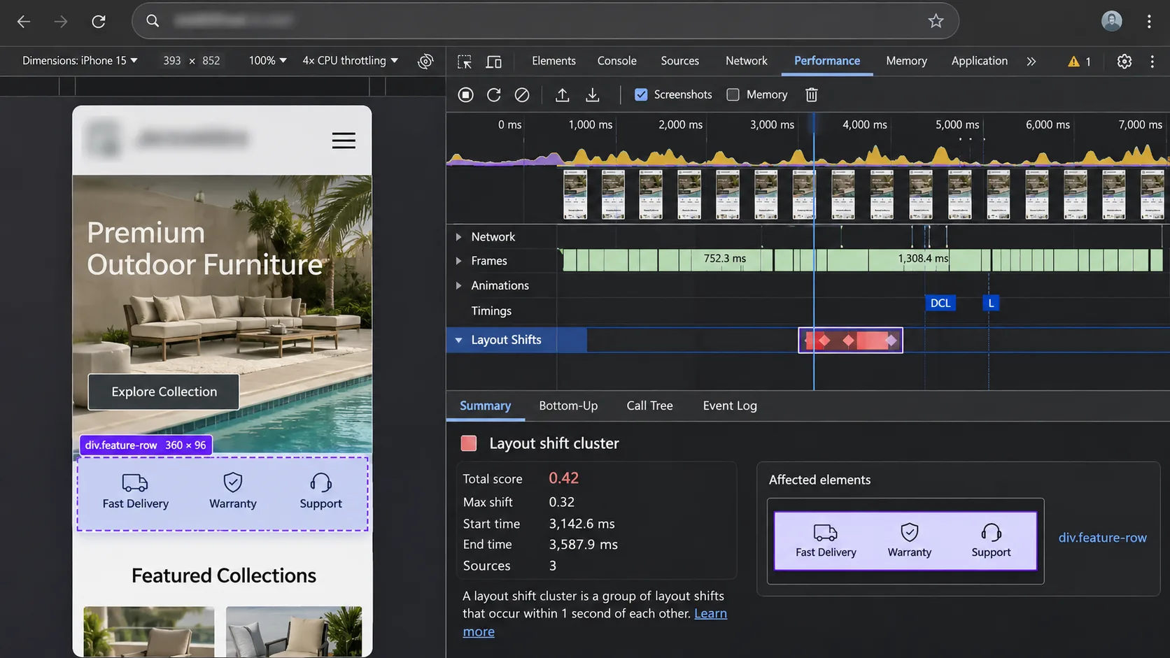
Whenever a client sends me a screenshot of a green Lighthouse score next to a failing Search Console CLS report, I do the same thing. I open DevTools, throttle the CPU to 4x slowdown, switch to a mobile viewport and start scrolling.
The shift shows up within a minute. It almost always does.
Google's Core Web Vitals report in Search Console grades CLS from real Chrome users over the last 28 days. Good is 0.1 or less, poor is above 0.25, and the number that counts is the 75th percentile of visits, not your best test run.
In my experience leading the engineering team at Vareweb, almost every mobile layout shift comes down to one lazy CSS habit: letting the browser guess an element's height until a third-party server finally answers. CLS isn't a mystery metric. It's a geometry problem.
Mobile Pages Jumping Around? Fix It at the Template Level.
Vareweb builds mobile-first, responsive websites made to load fast and stay stable on any screen size. Tell us which pages are failing and we'll tell you where to start.
Quick Comparison: Mobile CLS Culprits vs. Engineered Fixes
| Layout shift culprit | Why it breaks mobile viewports | The production fix |
|---|---|---|
| Web fonts | Fallback and custom fonts have different widths, so text rewraps and pushes content down when the WOFF2 file lands | Preload critical fonts, use font-display: optional where possible, match fallback metrics with size-adjust |
| Cookie and consent banners | A CMP injects a bar at the top of the body in normal flow after the page paints | position: fixed at the bottom, or a reserved top container in the initial HTML |
| Third-party embeds | Iframes and widgets render at zero or default height, then expand when their script runs | aspect-ratio wrappers, click-to-load facades, min-height skeletons |
| Ad slots | Ads load late, resize, or collapse when no bid wins | Reserve min-height for the slot, never collapse after render, avoid top-of-viewport slots |
| Unsized images and SVGs | No width and height, so the browser can't compute space before download | width and height attributes plus max-width: 100%; height: auto |
| Promo bars and sticky headers | JavaScript-injected bars and headers that change height push the whole page | Server-render bars with a fixed height, animate with transform |
| Late-injected widgets | Booking forms, reviews, chat and calculators load after paint and push content | Skeleton placeholders with matching min-height in the template |
The Rendering Reality: Cumulative Layout Shift on Mobile: Common Causes and Fixes
Here's the catch most people miss. Mobile is now where most of your field data comes from. StatCounter's September 2026 platform data puts mobile at 58.99% of worldwide web traffic, against 39.26% for desktop, so the phone report is the one Google has the most real visits for.
And plenty of sites still aren't there. An open dataset built from Chrome UX Report data, published in October 2026, found only 53.0% of all websites passed all three Core Web Vitals on mobile in August 2026.
So why does mobile fail when desktop passes?
Because the score is relative to the viewport. A 120-pixel jump on a 390-pixel-wide phone moves a much larger share of what the user can see than the same jump on a 1440-pixel monitor. Mobile also runs slower CPUs and slower networks, so fonts, ads and widgets arrive later, often after the user has started reading or scrolling.
The fix happens in the template, not in a speed plugin. Reserving container geometry and clean font fallbacks at the template layer is central to how we approach our web design services, and it's the core of every responsive web design build we ship.
1. Web Fonts Causing FOUT and FOIT Reflows
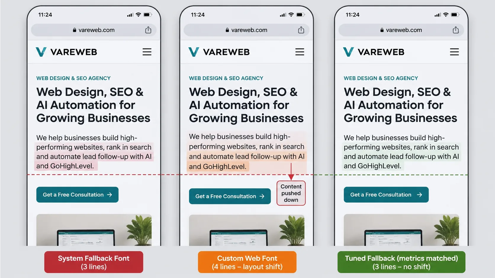
Picture a throttled 4G connection. The browser paints your headline and first paragraph in the fallback font, usually Arial on Windows or Roboto on Android, because your custom WOFF2 file hasn't arrived. Then it lands 600 milliseconds later. The custom font is a little wider, so a 4-line paragraph becomes 5 lines, and everything below it drops by one line height.
That's a flash of unstyled text (FOUT) turning into a layout shift.
Almost every site I audit loads at least one custom font, and very few preload it. Most run font-display: swap because a theme or a Google Fonts URL set it by default, and I rarely see optional at all.
My fix comes in three layers.
Preload only the one or two fonts used above the fold. Preloading every weight just steals bandwidth from your hero image.
Then pick the right font-display value. optional gives the font a very short window to load and otherwise keeps the fallback for that page view, so the text never swaps and never shifts. swap always shows the custom font eventually, which is better for branding but guarantees a swap on slow connections.
And when you need swap, make the fallback occupy the same box as the real font. CSS metric overrides do exactly that:
The percentages above are an example, not universal values. Calculate them for your font pair, or use a tool such as Fontaine or Next.js's built-in font optimization that generates them. MDN's size-adjust reference explains how the scaling works if you want to tune by hand.
2. Cookie Banners and GDPR Consent Overlays Pushing Content Down
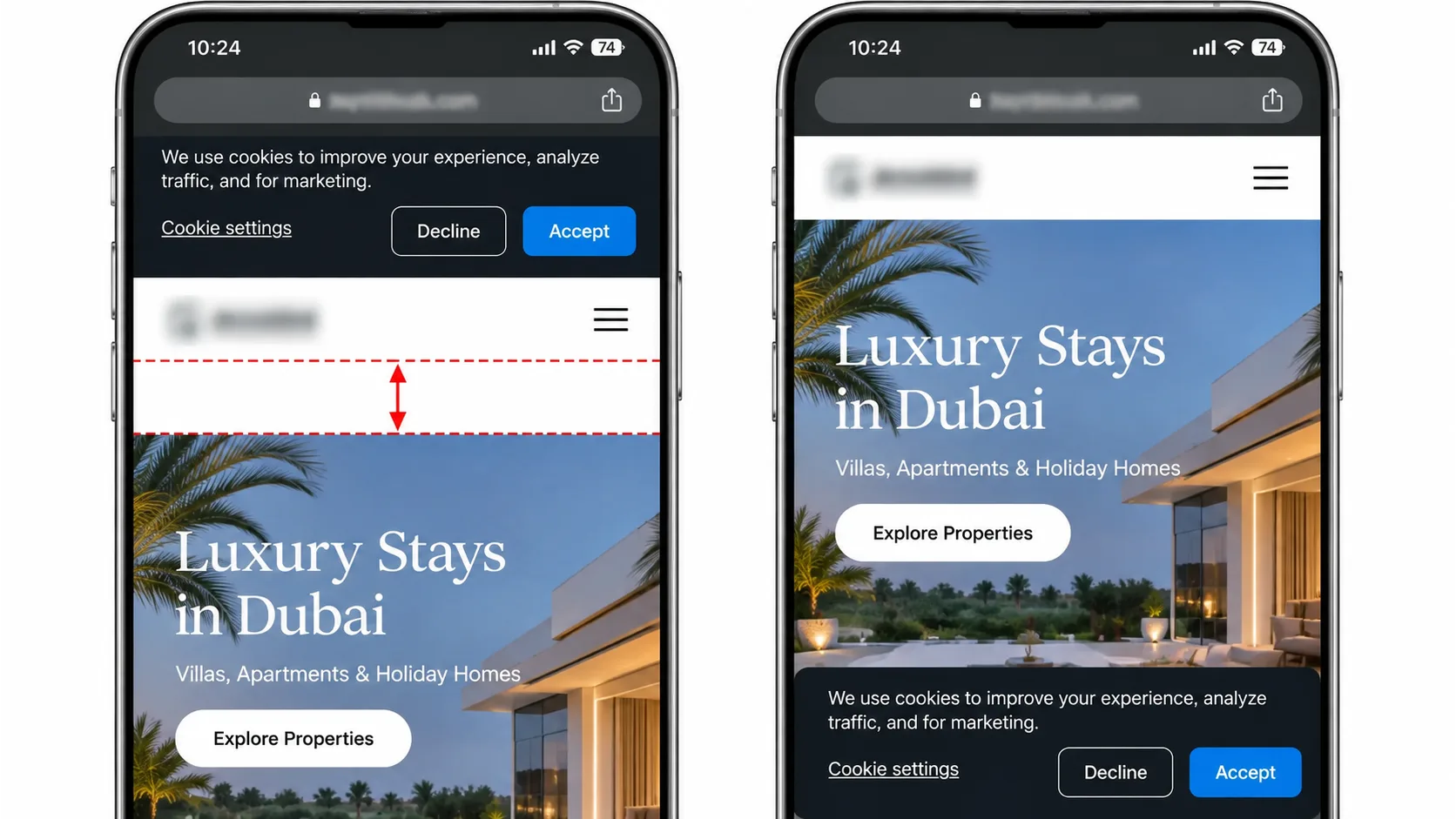
This is the classic consent mistake. The page paints, the consent management platform (CMP) script runs, and it injects a cookie bar at the top of the <body> in normal document flow.
On a 390px-wide phone, that bar can shove the whole hero down by more than 100 pixels. And it happens right when the user is looking at the screen.
Take the banner out of the flow. A fixed bar at the bottom of the viewport sits on top of the content instead of pushing it:
Fixed elements don't move other elements when they appear, so this doesn't count as a layout shift. Keep it from covering your main call to action, and test it on the smallest screen you support.
If your legal team insists on a top bar, reserve the space in the initial HTML and let the CMP fill it:
3. Third-Party Embeds (YouTube, Maps, Social Posts and Review Widgets)
Third parties are on almost every page I open. A typical mobile page pulls in a video embed, a map, a reviews widget and a chat launcher, often all on the same template.
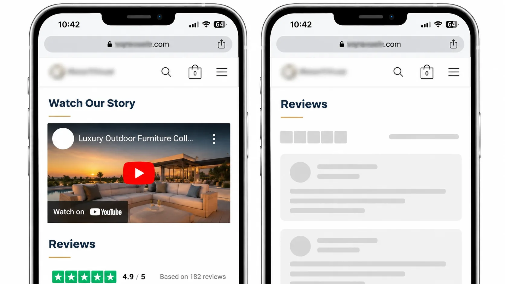
Each one is a box whose size you don't control until its script runs. A raw YouTube <iframe> without dimensions, an Instagram post, a Google Map or a Trustpilot carousel can all render at zero height and then expand.
For anything with a known shape, use aspect-ratio:
For a YouTube video above the fold, don't load the iframe at all on first paint. Show a static thumbnail with a play button inside the same 16:9 box, and swap in the iframe on tap. You save hundreds of kilobytes of JavaScript and the box never changes size.
Review widgets and social feeds are harder, since their height depends on content. Measure what they typically render on mobile and give them a skeleton:
Too much space is better than too little. A gap that shrinks slightly is far less damaging than content that jumps.
4. Dynamic Ad Slots and Programmatic Header Bidding
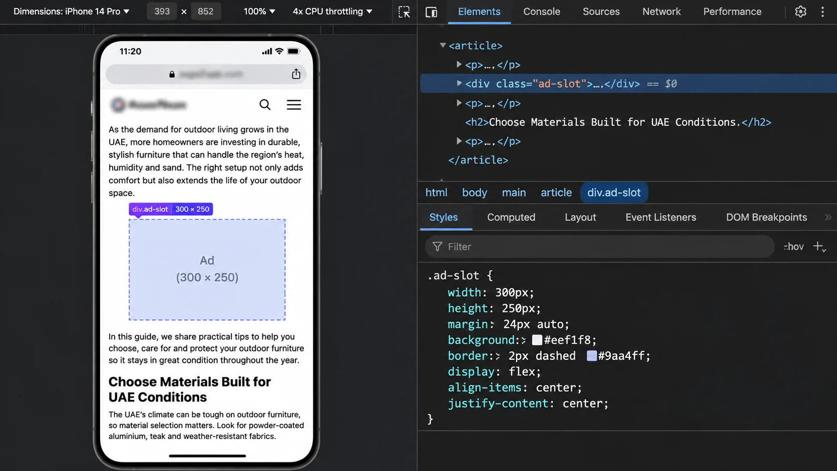
Publishers feel this one most. Google Ad Manager or a header-bidding wrapper loads ads asynchronously, the auction takes time, and the creative arrives after the reader has started the article. Then a larger creative wins, or no bid wins and the slot collapses, and the text snaps up and down mid-sentence.
That's where accidental ad taps come from.
Google's own guide to minimizing layout shift with Google Publisher Tag says the only guaranteed way to avoid it is to reserve enough space for each slot in CSS. I wrap every slot:
A few rules I follow on every publisher build:
- Reserve the largest size you've configured for a multi-size slot, or at least the most common one.
- Never collapse a slot after it has rendered. If a slot often goes unfilled, have it start collapsed instead, or fill it with a house ad.
- Keep dynamic ads out of the first screen on mobile. A shift near the top of the viewport moves everything below it, so it costs the most.
- Watch ad refresh. A refresh that loads a taller creative halfway down the page is a shift Lighthouse will never see.
Layout Shifts Built Into the Whole Site? A Redesign May Beat Patching.
When the shifts come from the template itself, page-by-page fixes only go so far. Vareweb's redesign work includes performance and speed improvements, with redirect mapping so the rankings you've earned carry over.
5. Unsized Images, Responsive Breakpoints and Late-Rendering SVGs
This one should be solved by now. It isn't. On almost every theme audit I run, at least one image ships without dimensions, usually the logo, a hero image on a landing page template or an icon added by a page builder.
Without width and height, the browser can't work out an image's aspect ratio until it downloads the file, so it reserves zero height and reflows when the image arrives. Logos, hero images and inline SVG icons injected after the CSS loads are the usual offenders.
Modern browsers turn those two attributes into an aspect ratio before downloading a single byte. The CSS then scales the image to the mobile column without losing that ratio.
Art direction needs one extra step. If you use <picture> with a different crop for mobile, set width and height on each <source> too, or the browser uses the wrong ratio at that breakpoint.
6. Top Announcement Bars and Sticky Header Shrinking
"Free shipping over $50" is a great message. Injecting it with JavaScript after the page renders is a terrible way to deliver it.
A promo bar added at the top after paint pushes every element on the page down at once. A sticky header that shrinks from 96px to 64px on scroll by changing its height or padding does the same thing in reverse, every time the user scrolls.
Render the bar in the initial HTML with a locked height, even if a script decides the message later. And animate headers with transform, which the GPU handles without changing layout:
Height-based animations are still everywhere in the themes I inherit. Changes to transform and opacity don't count as layout shifts. Changes to height, top, margin and padding can.
Banners, Sticky Headers and Widgets Are Design Decisions Too
Vareweb's UI/UX team designs interfaces around usability testing and accessibility standards, so the elements that pop in and push content down get planned for from the start, not patched in later.
7. Late-Injected Widgets (Booking Forms, Reviews, Chat and Calculators)
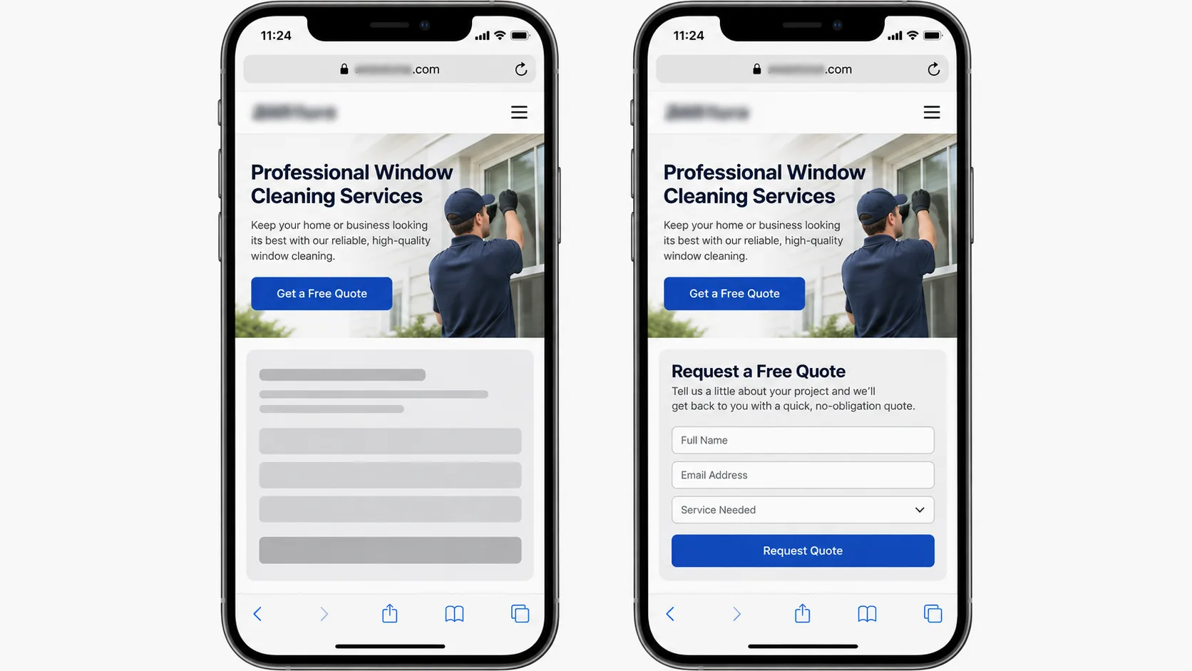
Every industry has its own version of this one. A clinic's booking widget, a SaaS signup form, a mortgage calculator on a real estate listing, a law firm's intake form, review stars on a product page. The script runs after load, drops the widget into the middle of the page, and the "Book Consultation" or "Get a Quote" button falls 80 pixels just as the visitor's thumb comes down.
They tap the wrong thing. Or they leave.
Hardcode the space into the template so each widget fills a box that already exists:
The same pattern works in any CMS: a wrapper in a WordPress block template, a Webflow embed, a Shopify section or a React component. Measure the widget's real height on a phone, not in the vendor's demo.
Then make the widget render inside that wrapper instead of wherever its script decides. Most embeds let you choose the mount point with a container ID, a shortcode or an app block.
Old templates are usually where these patterns pile up, and sometimes patching them costs more than rebuilding. I covered how to make that call in my post on when and why to redesign your website. My colleague Kashaf, Vareweb's SEO Manager, lists the design habits that keep these metrics green in his guide to UI/UX design tips for flawless Core Web Vitals.
When a site is full of these patterns, our website redesign projects fix them in the template layer rather than one widget at a time.
Smaller Fixes Most Teams Miss
The seven big culprits cover most failing reports. These smaller ones clean up the rest.
- Back/forward cache. When a page is restored from bfcache, it comes back exactly as the user left it, with no reload and no re-shifting. An unload handler can block that, so remove them and check the Back/forward cache panel in DevTools' Application tab for other blockers.
- Carousels and sliders. Auto-advancing slides that change height between items shift everything under them. Give the track a fixed aspect ratio and move slides with transform.
- Infinite scroll and "Load more". Insert new items below the viewport, or behind a placeholder of the right height, never above what the user is reading.
- content-visibility: auto. Great for long pages, but without contain-intrinsic-size the skipped sections report the wrong height and shift the scrollbar as they render.
- Chat widgets and launchers. Keep them position: fixed and check that the launcher bubble doesn't resize the page when it opens a greeting.
None of these needs a rebuild. Each is a CSS rule or a template change you can ship in an afternoon.
Why Your Lighthouse Score Says 0.00 While Search Console Fails Your Mobile Pages
Lighthouse is a lab tool. It loads the page once on a simulated device and measures shifts during that load. It doesn't scroll, tap, wait for an ad refresh or open your mega menu.
Search Console uses CrUX field data, collected from real Chrome users across the whole life of the page. Under Google's CLS definition, shifts are grouped into session windows of up to 5 seconds, and your score is the largest window. A lazy-loaded embed or an ad that resizes halfway down an article counts in the field. It never shows up in the lab.
That's the whole mystery behind "green in Lighthouse, red in Search Console."
Single-page apps add another layer. In October 2026, Chrome added experimental soft-navigation metrics to CrUX, including a CLS version that splits shifts across route changes inside an SPA. Only 7.0% of Android origins use soft navigations for more than half their page views, but that jumps to 35% among the top 1,000 sites. If you run a Next.js, Nuxt or other SPA-style site, check that experimental metric in CrUX Vis before trusting your stable CLS number.
To see what real users experience, log layout shifts with the PerformanceObserver API on a real phone or a throttled emulator, then scroll the way a reader would:
Each LayoutShift entry includes the elements that moved in its sources property, which MDN documents in its LayoutShift API reference. The hadRecentInput check filters out shifts right after a tap or keypress, since those don't count toward CLS.
Search Console groups similar URLs together, so think in templates, not pages. If 4,000 blog, service or listing URLs fail CLS, the problem is almost always one template or one script running on all of them. Fix the template once and the whole group moves.
My debugging routine, every time:
- DevTools open, mobile viewport, CPU throttled 4x, network on Slow 4G.
- Record a Performance trace while you load, wait, scroll to the bottom and back up.
- Open the layout shifts track and click each cluster to see which element moved.
- Fix the biggest cluster first. One bad ad slot usually outweighs ten tiny shifts.
After you deploy fixes, click "Validate fix" in Search Console. That starts a 28-day monitoring window of CrUX data, so the warning won't clear overnight. Kashaf explains how these field scores feed into rankings in his post on how important page speed is for SEO in 2026.
Search Console Still Flagging Your Mobile Pages?
Vareweb's SEO work starts with a technical audit, so you know which templates are failing before anyone touches code. Monthly reporting then shows whether the fixes are holding.
FAQs
What is a good Cumulative Layout Shift (CLS) score on mobile?
0.1 or less at the 75th percentile of real mobile visits. Between 0.1 and 0.25 needs improvement, and above 0.25 is poor.
Why is my mobile CLS score worse than my desktop score?
The same pixel jump covers more of a small screen, and slower phones load fonts, ads and widgets later. Mobile layouts also stack more elements in one column, so one shift pushes more content.
Do user clicks or taps count toward Cumulative Layout Shift?
No. Shifts within 500 milliseconds of a tap, click or keypress are excluded. Scrolling doesn't count as input, though.
How do I find which element is causing CLS on mobile?
Record a throttled mobile trace in Chrome DevTools and check the layout shifts track. Or log layout-shift entries with PerformanceObserver and read their sources.
Does font-display: swap cause Cumulative Layout Shift?
It can, if the fallback and custom fonts have different metrics. Match them with size-adjust and the override descriptors, or use font-display: optional.
How long does Search Console take to clear a CLS warning after a fix?
About 28 days after you start validation, because the report uses a rolling 28-day window of field data.
Does the CSS contain: layout property help reduce unexpected layout shifts?
It isolates layout work inside an element, but the element can still grow and push its neighbors. Pair it with fixed dimensions, min-height or contain-intrinsic-size to actually lock the box.
Want a Mobile Experience That Stays Put?
Book a free call and Vareweb will look at your mobile pages with you, work out what's causing the shifts, and map the fastest route to a stable layout.

Written by
Minhaj
Minhaj Ahmed is an experienced web and software development professional specializing in web applications, mobile apps, SaaS platforms, and AI-powered solutions. As Head of Development at Vareweb, he brings a strong software engineering background to building scalable digital products and automation systems. He writes about web development, mobile apps, AI, software engineering, and emerging technologies.