
Quick Answer: The ecommerce design improvements that can have the greatest impact on sales in 2026 come down to five fundamentals: fast mobile-first performance, intuitive navigation and search, informative product pages, strategically placed trust signals, and a low-friction checkout. Shoppers should be able to find the right product quickly, get their important pre-purchase questions answered, feel confident about pricing and payment, and complete their order without unnecessary steps. Personalization, visual polish, and other enhancements should support these five priorities rather than distract from them.
In my audits, the ecommerce sites that quietly outperform their competitors all share the same handful of design behaviors, and almost none of them are visually flashy. I've seen stores add several points of conversion without touching their ad budget - purely by fixing navigation, product pages, and checkout. The fastest way to improve an ecommerce site in 2026 isn't a full redesign; it's fixing the mechanics that actually move orders.
Worth grounding that in real numbers before anything else: IRP Commerce's live UK/Ireland trading data put session conversion at 2.03% in June 2026, up from 1.85% a year earlier - a real, measured improvement, not a projection. Most stores sit well below the stores that actually apply these ecommerce website design tips consistently, and the gap is rarely about traffic quality. It comes down to design mechanics, filling the exact same gap as Ecommerce Development Services.
Most Conversion Problems Aren't a Design Problem - They're a Mechanics Problem
Session conversion is climbing industry-wide, and the stores pulling ahead aren't the flashiest ones - they're the ones that fixed navigation, product pages, and checkout mechanics. Vareweb audits those mechanics first, before touching a single visual element.
What "Good Ecommerce Web Design" Actually Means in 2026
It's a trust-and-friction problem before it's a visual one: shoppers need to believe the store is legitimate, and then get through the purchase without surprises. Good design balances aesthetics, usability, and performance to move someone smoothly from browsing to buying - and mobile-first isn't optional anymore. Quick reference before the 18 practices in detail:
| Focus Area | What It Solves | Biggest Risk If Ignored |
|---|---|---|
| Homepage & Navigation | First impression and wayfinding | Immediate bounce and lost product discovery |
| Product Discovery | Helping shoppers find the right item quickly | High-intent shoppers leave for a competitor |
| Product Pages | Answering the questions shoppers need resolved before buying | Purchase hesitation and silent abandonment |
| Trust & Reassurance | Removing “is this legitimate?” doubt | Abandonment at the price, payment, or checkout stage |
| Checkout & Mobile | Turning purchase intent into a completed order | A major revenue leak from shoppers who were already ready to buy |
| Performance & Accessibility | Keeping the store fast, usable, accessible, and visible | Lost traffic, poor usability, and reduced search visibility |
18 Best Ecommerce Web Design Practices
1. Nail Your Homepage Above the Fold
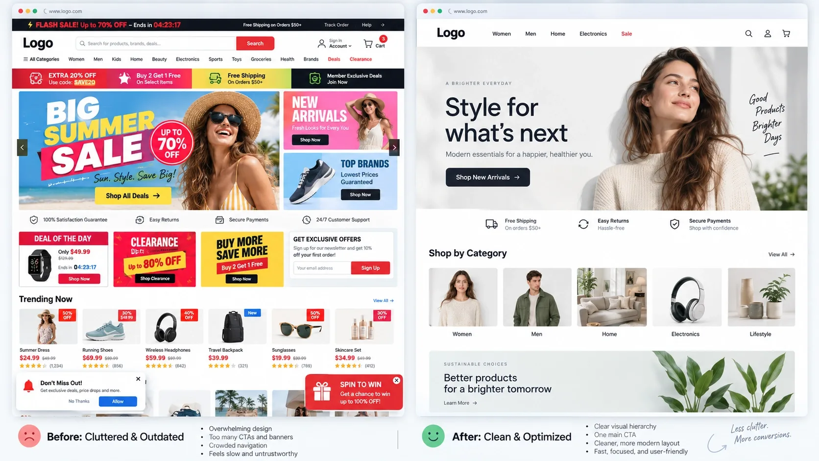
One clear value proposition, a strong hero visual, a single primary CTA, clean nav, and a visible search bar - all without scrolling. This is the first impression for new visitors, and confusion here causes immediate bounce. Skip rotating carousels; they dilute the one message that actually matters, and most visitors never see slide two or three anyway.
In practice: write the tagline before touching visual design, not after - if you can't state what you sell and who it's for in one sentence, no hero image will fix that ambiguity. Test the hero on a laptop screen and a phone screen separately, since what reads as "clean" on a 27-inch monitor often collapses into a cramped mess on mobile. This is exactly the layer UI/UX Design work should get right before anything else on the site.
2. Keep Navigation Simple and Category Structure Human
Short top navigation with mutually exclusive categories, logical subcategories, and breadcrumbs. Shoppers should reach any product within roughly three clicks - confusing information architecture kills discovery before a product ever gets a chance.
Audit your own menu the way a first-time visitor would: if a category name needs an explanation to make sense, rename it. Keep top-level items to seven or fewer, push specific attributes (size, brand, material) into filters rather than separate menu entries, and make sure breadcrumbs appear on every product and category page, not just some of them.
3. Design a Powerful, Forgiving Search
A prominent search bar that handles typos and synonyms, with results that support filtering. High-intent shoppers often go straight to search, and a poor result set sends them straight to a competitor's search bar instead. Track "no result" queries - they tell you exactly what your catalog or content is missing.
Test your own search with deliberately misspelled terms, partial product names, and plural/singular variants before trusting it. A search bar that returns zero results for "tshirt" when you sell "T-Shirts" is losing sales silently, with no error message and no way to know unless someone checks the logs.
If Shoppers Can't Find It, They Can't Buy It
Confusing navigation, weak search, and cluttered category pages all fail the same way - a shopper who was ready to buy gives up before they ever reach a product page. Vareweb's UI/UX work is built around getting shoppers to the right product fast.
4. Build Category Pages for Scanning, Filtering, and Confidence
Responsive grids with key info visible on each tile - price, rating, stock - filters based on real decision drivers, and a little explanatory copy. Category pages are where many shoppers decide whether your catalog fits their need at all.
Choose filters based on what shoppers actually decide by, not what your database happens to store - size and color matter for apparel, but a filter for "internal SKU prefix" helps nobody. Keep grid density consistent across devices, and make sure out-of-stock items are visibly marked rather than just disappearing, which reads as a bug more often than it reads as inventory management.
5. Make Product Pages Answer Everything Needed to Buy
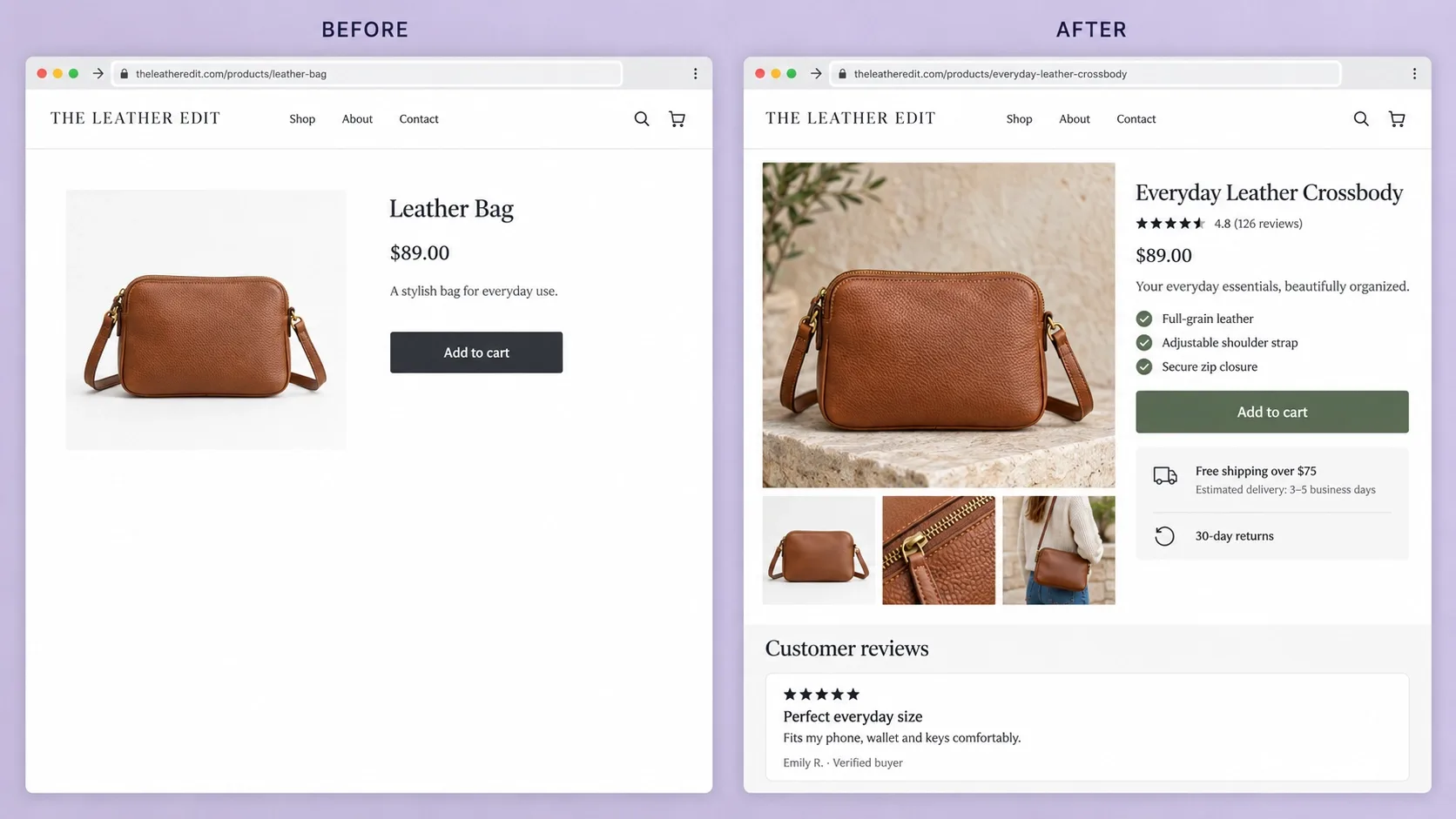
Name, price, options, stock, and a high-contrast Add to Cart button visible without scrolling, with benefits-led copy, specs, reviews, and shipping details below. Product pages are where conversion happens or dies - missing information just becomes hesitation.
Write the copy to answer the three questions every shopper silently asks: what is this, is it right for me, and what happens after I buy. A spec table answers the first, benefit-led copy answers the second, and clear shipping and returns information answers the third - skipping any one of them pushes the decision into "I'll think about it," which usually means never.
6. Use Strong Product Media - Scale, Context, and Detail
A real sequence per product: hero shot, clean studio image, close-ups, a scale reference, a usage shot, ideally video. Shoppers need to see what they're actually buying, at real scale, before they'll commit to a purchase they can't physically touch.
On the technical side, this is where a lot of otherwise-good product photography gets undermined: export in WebP or AVIF rather than raw JPEG, target well under 200KB per image at display size, and write specific alt text for each one - "black leather wallet, front view" rather than "product image" repeated across the whole gallery. Beautiful photography that takes four seconds to load has already lost the shopper before they see it.

7. Make CTAs Visually Dominant and Consistenttrong>
One primary CTA per screen, a button color reserved exclusively for that action, and consistent styling site-wide. If everything competes for attention, nothing wins it - a diluted CTA is a slower funnel, not a bolder one.
Pick one color for "Add to Cart" and "Checkout" and never reuse it for anything else on the site - not a secondary link, not a promotional badge. Repeat the CTA at the bottom of long product pages rather than forcing shoppers to scroll back up once they've decided.
8. Put Trust Signals Where Doubt Actually Happens
Reviews, ratings, security badges, and clear policies placed near price and checkout - not buried on a separate page. Trust doubt ("is this legit, can I return it") is a major, specific cause of abandonment, and it has to be answered exactly where the doubt arises. I go deeper on what actually earns attention here in What Trust Badges Mean and Why They Are Important.
Place the review count and star rating directly under the product title, not below the fold. A one-line return policy summary next to the Add to Cart button - "Free returns within 30 days" - does more to reduce hesitation than a link to a full policy page most people will never click.
Trust Signals Only Work if They're in the Right Spot
A five-star rating buried on a separate page does nothing at the moment a shopper is deciding whether to enter their card details. Vareweb builds trust signals and cost transparency directly into the product and checkout templates - not bolted on after.
9. Show Shipping Costs and Returns Early, Not Just at Checkout
Estimate shipping and tax on the product or cart page, and state your returns policy near the Add to Cart button. Late-stage cost surprises are a classic, well-documented abandonment trigger - I cover the full pattern in How to Reduce Cart Abandonment in 2026.
If exact shipping depends on address, show a reasonable estimate or a threshold nudge - "Free shipping over $50" - rather than nothing at all. Silence on cost doesn't make the number smaller; it just moves the moment of disappointment further down the funnel, where it costs you more.
10. Streamline Checkout - Guest Checkout, Fewer Steps, Clear Progress>
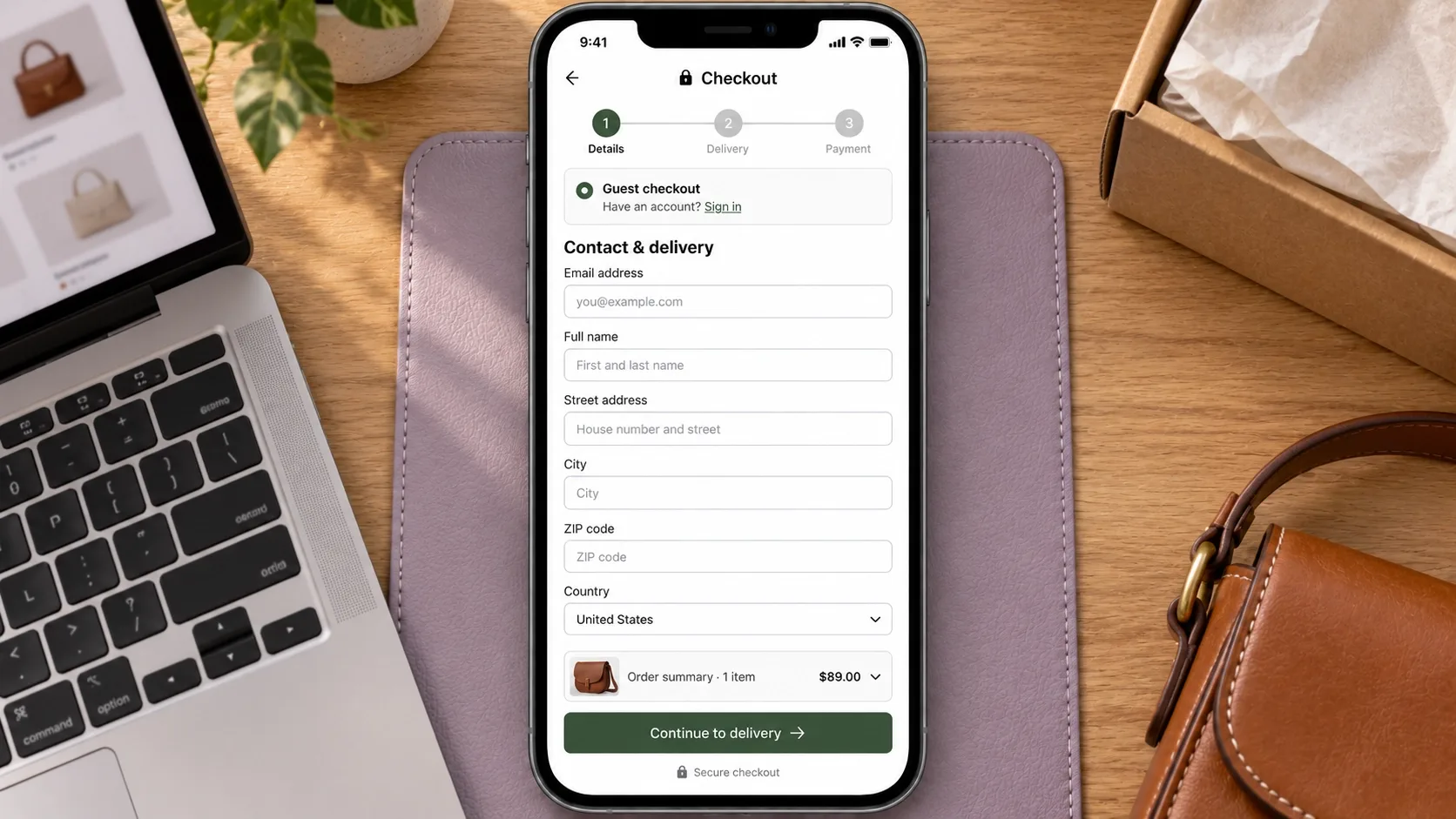
Single-column forms, a visible progress indicator, guest checkout as the default, and live validation as someone types. Checkout friction is where a large share of carts die, and simplifying this one step consistently yields the biggest single gain available. The same form-design discipline applies directly here as it does anywhere else on the site - see How to Design Forms That Get Completed.
Count your checkout fields honestly - most stores can get essential information in under ten. Every optional field (company name, a second phone number) should be removed unless it's genuinely required for fulfillment, and address autofill should be on by default, not an afterthought a developer adds later.
11. Design Checkout Mobile-First and Thumb-Friendly
Single-column mobile checkout, generous tap targets, a sticky bottom CTA, and wallet integrations like Apple Pay. Global traffic now sits almost exactly split - 50.13% mobile versus 49.87% desktop as of August 2026 - and most abandonment happens on the mobile half. I cover the specific layout decisions that hold up under that split in Mobile-Friendly Design Best Practices for Improving Conversions and Better UX.
Test checkout with one thumb, on a real mid-tier phone, not a flagship device on office wifi. Numeric keyboards should appear automatically for card and phone fields, and Apple Pay or Google Pay should sit above the fold on the payment step - not below a wall of form fields most mobile shoppers won't finish typing.
12. Obsess Over Speed, Core Web Vitals, and the Hosting Underneath Them
Compressed modern-format images, lazy loading, a CDN, and a hard limit on third-party scripts. Every extra second of load time costs conversions directly and factors into how both traditional and AI-driven search assess page quality. I've written more on the specific numbers that matter in 10 Best UI/UX Design Tips for Good Core Web Vitals.
None of that front-end work matters if the hosting underneath it is weak. Shared, low-cost hosting is the single most common root cause I find behind a slow server response time that no amount of image compression fixes - if Time to First Byte is high, the problem started before a single asset even loaded. Budget for hosting sized to your actual traffic and catalog, not the cheapest plan available, and treat a CDN as standard rather than optional.
Fast Front-End, Slow Server - Still a Slow Site
Image compression and lazy loading don't fix weak hosting underneath them. Vareweb pairs front-end performance work with hosting sized to your actual traffic, so Time to First Byte stops being the bottleneck nobody looked at.
13. Make the Site Accessible and Inclusive
Alt text, sufficient contrast, keyboard navigation, and descriptive labels, following WCAG guidelines at a genuine baseline, not a checkbox pass. This widens your addressable audience and keeps you from silently locking out shoppers on assistive devices.
Run an automated accessibility checker first, then manually tab through your own checkout using only a keyboard - no mouse - to feel where real people actually get stuck. Fix the elements shoppers must interact with to complete a purchase (menus, forms, the Add to Cart button) before worrying about decorative content.
14. Use Personalization Carefully - to Help, Not Confuse
A small number of genuinely relevant recommendations - related items, frequently bought together - within a stable, predictable layout. Good personalization lifts order value. Overly dynamic, unstable layouts overwhelm shoppers instead of helping them.
Limit recommendation blocks to three or four items and keep their position consistent across visits - a homepage that rearranges itself every session feels unfamiliar rather than tailored. Measure whether a recommendation module actually gets clicked before assuming it's helping; plenty of them sit unused, quietly adding page weight for nothing.
15. Build Semantic HTML and Structured Data>
Clean heading structure plus Product and Offer schema that matches your visible price, stock, and rating exactly. Search and AI engines rely on this structure to understand your catalog and match it to real queries - mismatched data undermines the trust signal it's supposed to send. I go deeper on the template-level implementation in How Schema Markup and Web Design Work Together, and it's a standing part of how Ecommerce SEO work should be scoped, not an afterthought bolted on post-launch.
Validate schema against a rich-results testing tool after every major template change, not just at launch - a theme update or a new app can silently break markup that was correct for months. Keep one system responsible for generating it; two plugins both trying to output Product schema is a common, easy-to-miss source of conflicting data.
Schema Only Helps if It Matches What's Actually on the Page
Mismatched Product schema - a price or stock status that doesn't match what shoppers see - undermines the exact trust signal it's supposed to send to search and AI engines. Vareweb keeps schema and content in sync as a standing part of Ecommerce SEO, not a one-time setup.
16. Reduce Visual and Content Noise Across the Site
Simple layouts, limited pop-ups, no overlapping promotions, and tight, benefit-focused copy. Visual noise creates cognitive load, and shoppers bail the moment a page feels overwhelming rather than clear - see Why Too Many Options on Your Website Cost You Sales for the deeper mechanism.
Audit any page carrying more than one pop-up, banner, or promotional bar at once - stacking them rarely adds urgency, it just adds noise the shopper has to mentally filter out before reaching the actual content. One well-timed offer outperforms three competing ones almost every time.
17. Use Data to Drive Continuous Improvements, Not Big Redesigns
Quarterly reviews of analytics, heatmaps, and checkout error logs, with iterative fixes instead of a full rebuild every few years. The fastest wins usually come from fixing one specific leak - a slow page, a confusing filter - not from a total visual overhaul. This is the discipline behind web analytics done properly.
Put a recurring date on the calendar rather than waiting for a problem to surface on its own. Review conversion by device and by page, not just the site-wide average, since a healthy overall number can easily be hiding a badly underperforming mobile checkout underneath it.
18. Design Trustworthy Brand Touchpoints - Including Support
A genuinely honest About page, plus clear Shipping, Returns, and Contact pages written in plain language with real photos. Shoppers check these specific pages when deciding whether to trust a store they've never bought from before - I cover what actually earns that trust in 15 Tips to Write an About Us Page That Builds Trust.
Support belongs in this list, not as an afterthought bolted onto Contact. A visible live-chat option, a genuinely useful FAQ or help center covering shipping times and return steps, and an honest response-time expectation all reduce the exact pre-purchase anxiety this whole list is trying to remove. A support page that only offers a generic contact form, with no phone number and no stated response window, reads as a store hoping you won't need help - which is precisely the impression you don't want to leave.
Before/After Pattern From Real Ecommerce Audits
A realistic pattern, not a specific client claim: before, a visually nice but slow site - cluttered homepage, complex navigation, thin product pages, hidden shipping costs, forced account creation. After, faster pages, a clear homepage, simplified navigation, enriched product pages with real photography and reviews, visible shipping and returns, guest checkout, and express payment options.
Described directionally: conversion typically moves from a low single-digit rate into the mid-to-high single digits. Cart abandonment drops, particularly on mobile. And the store earns more revenue from the traffic it already has, rather than needing to buy more of it.
How to Measure Whether Your Ecommerce Design Is Working
Track conversion rate by device, add-to-cart and checkout-completion rates, bounce rate on key pages, and Core Web Vitals scores. Run small A/B tests on one variable at a time - CTA text, a layout tweak, a checkout field - and use heatmaps or session recordings to see real behaviour rather than guessing at it. Review the data quarterly and adjust; treat this as a cycle, not a one-time project.
Ready to Turn More Browsers Into Buyers?
Vareweb builds ecommerce stores engineered around the fundamentals that actually move conversion - navigation, product pages, trust, checkout, and the performance underneath all of it. One team, accountable for the whole result.
Practical Checklist
☐ Does your homepage above the fold clearly show what you sell and how to start shopping?
☐ Can users reach any product in roughly three clicks via clear navigation and search?
☐ Are category pages scannable, filterable, and reassuring?
☐ Do product pages show rich media, clear pricing, strong CTAs, and reviews?
☐ Are shipping costs and returns visible before checkout, not just at it?
☐ Is checkout short, guest-friendly, mobile-first, and clearly signposted?
☐ Do you show trust signals near CTAs and payment forms specifically?
☐ Is your site fast and stable on mobile, within recommended Core Web Vitals thresholds?
☐ Is your site genuinely accessible, not just automated-tool compliant?
☐ Have you implemented semantic HTML and product/FAQ structured data?
☐ Do you track conversions and errors, and actually act on what you find?
Frequently Asked Questions
What is the most important ecommerce design fix to make first?
Checkout friction and page speed, in most audits - Tips 10 through 12. Trust and content improvements matter, but they can't rescue a slow site or a checkout people abandon before finishing.
How quickly can design changes impact conversion?
Some changes - shipping transparency, guest checkout - can shift behavior within weeks. Structural changes like navigation or product-page rebuilds take longer to show a clean signal in the data.
Do I need a complete redesign, or can I iterate?
Iterate, in almost every case - see Tip 17. Full redesigns are riskier, slower, and usually address problems that targeted fixes would have solved just as well.
How many product images are "enough"?
Enough to show scale, context, and detail - typically six to ten per product, per Tip 6. More matters less than covering those three angles well.
Should I force account creation to build loyalty?
No - default to guest checkout and offer account creation after the purchase completes, when there's no friction cost left to pay. See Tip 10.
How much does site speed really affect revenue?
Directly and measurably - slow pages lose conversions and standing in both traditional and AI-driven search at the same time. See Tip 12.
Are pop-ups and banners always bad?
No, but stacked, poorly timed ones are - see Tip 16. One well-timed, relevant pop-up rarely hurts; three competing ones almost always do.
How do I design for both mobile and desktop without duplicating work?
Design mobile-first as the primary layout, then adapt up to desktop rather than the reverse - see Tip 11. It's less duplicated effort than it sounds once the mobile constraints are settled first.
Is personalization mandatory for modern ecommerce?
No, but a small, relevant dose - Tip 14 - tends to lift order value. Aggressive, unstable personalization does more harm than doing none at all.
What's the simplest way to start improving my ecommerce design this month?
Pick the single highest-traffic product page and apply Tips 5, 8, and 9 to it alone. A focused fix on one page teaches you more than a scattered pass across the whole site.

Written by
Kashaf
Kashaf is a veteran SEO specialist with deep expertise in AI SEO, generative engine optimization, ORM, web strategy, and marketing automation. With a Master's in Computer Science, he blends search strategy with technical insight into websites, automation workflows, and AI-driven platforms, helping brands dominate traditional search while adapting to the future of AI-powered discovery.