Quick Answer: A PPC landing page converts when it repeats the ad's promise in the headline, shows the offer, proof and one call to action on the first mobile screen, loads its main content in under 2.5 seconds, and removes every link that doesn't lead to a conversion. Fix those four and you improve Google Ads landing page experience, conversion rate and cost per lead at the same time.
When a business owner tells me their Google Ads "stopped working," I don't open the ad account first. I open the landing page on my phone, on mobile data, and count how long it takes before I can see what they sell and how to get it.
Most of the time, that count is the whole diagnosis.
Paid clicks aren't cheap anymore. WordStream's 2026 Google Ads benchmarks, built on 13,474 U.S. search campaigns that ran from April 2025 to March 2026, put the typical cost per click at $5.42 and the typical cost per lead at $66.69. Every visitor who leaves a slow or confusing page is money already spent.
The same report holds the more useful signal. Cost per lead fell for the first time in five years, while conversion rates rose in 87% of industries. Clicks didn't get cheaper. The advertisers who came out ahead converted more of the clicks they already paid for, and that happens on the landing page.
The ad earns the click. The page decides whether the click was worth paying for.
In my experience leading Vareweb's development team, the gap between a page that converts and one that leaks is rarely about the design trend of the month. It comes down to a handful of decisions about focus, speed and trust, and almost all of them can be fixed without touching the ad budget.
Paying for Clicks That Don't Convert? Start With the Page.
Vareweb designs and builds custom pages around one goal: turning the traffic you're paying for into leads. Send us the page your ads land on and we'll tell you what we'd change first.
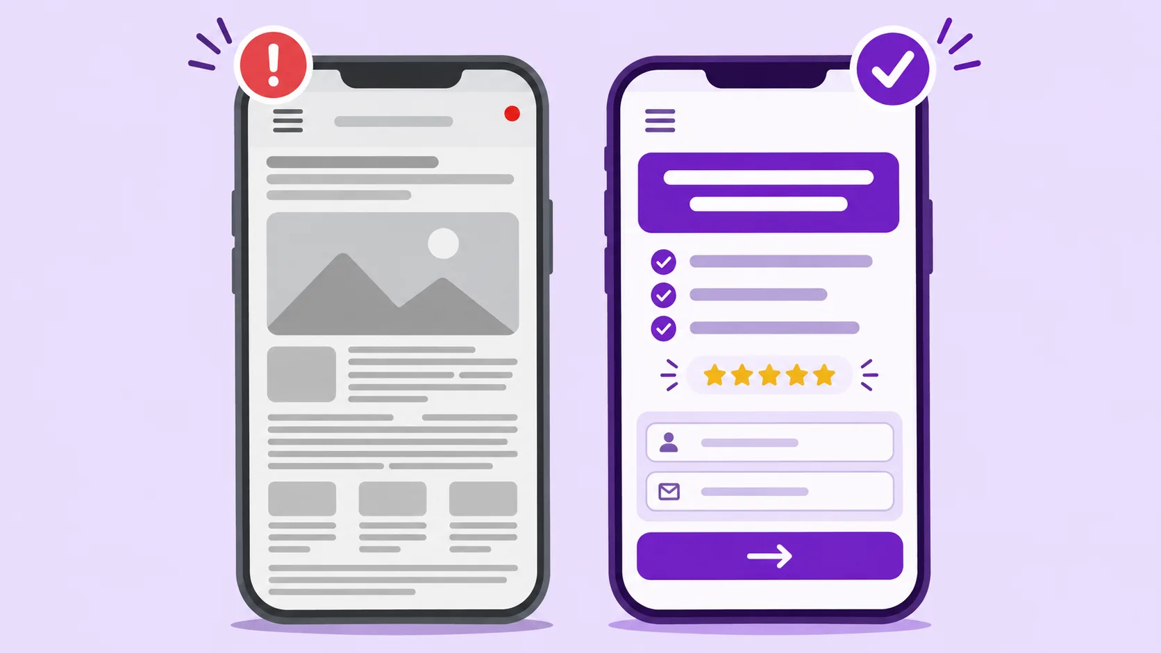
Quick Comparison: A Leaking PPC Page vs a Converting One
| Element | What we usually find | What converts |
|---|---|---|
| Headline | Brand slogan or "Welcome to…" | Repeats the keyword and offer from the ad |
| Navigation | Full site menu, blog and social links | Logo, one CTA, phone number, legal links only |
| First mobile screen | Large hero image, offer below the scroll | Offer, proof and button or form visible |
| Form | 8 to 12 fields on one screen | 3 to 5 fields, or a two-step form |
| Mobile speed | Main content appears after 4 to 6 seconds | Largest Contentful Paint under 2.5 seconds |
| Phone number | Plain text | Tap-to-call link with call tracking |
| Proof | Client logos in the footer | Reviews and results next to the form |
| Testing | Full redesign when results dip | One change at a time, tracked in Google Ads |
What a PPC Landing Page Actually Has to Do
A PPC landing page is the page your ad's final URL points to. It exists for one visitor, with one intent, who just clicked one promise.
That makes it different from your homepage. A homepage introduces the whole business to everyone. A landing page answers one question for one person and asks them to take one step.
Google judges that page too. Landing page experience is one of the three components of Quality Score, next to expected click-through rate and ad relevance. Google's own landing page experience guidance asks whether the page is clear and useful, related to what the person searched for, and easy to navigate.
Quality Score itself is a diagnostic rather than a direct input into the auction. Google scores it from 1 to 10 at the keyword level, and the signals behind it still shape your Ad Rank, which is why a page that matches intent and loads fast is cheaper to send traffic to.
2026 PPC Benchmarks: What a Lead Costs in Your Industry
Before you judge a landing page, know what normal looks like for your market. These are the figures we compare client accounts against, from WordStream's 2026 report for the industries we build for most often.
| Industry | Conversion rate | Cost per lead |
|---|---|---|
| All industries | 8.18% | $66.69 |
| Home & Home Improvement | 8.05% | $90.92 |
| Dentists & Dental Services | 10.67% | $72.97 |
| Attorneys & Legal Services | 5.55% | $131.63 |
Source: WordStream 2026 Google Ads benchmarks, Google and Microsoft search campaigns, April 2025 to March 2026. WordStream reports these averages as medians to limit the pull of outliers.
Read the table as a floor, not a finish line. A home services page converting at 4% is losing half its leads to the page, not the market. A legal page at 5.5% may still be worth rebuilding, because at $131 a lead every point of conversion rate is real money.
12 PPC Landing Page Best Practices We Use on Every Build
1. Match the Ad, the Keyword and the Headline
Message match is the first thing I check, and the cheapest thing to fix.
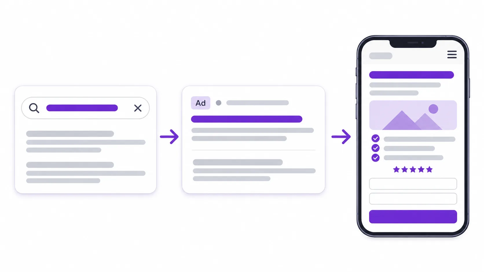
If someone searches "emergency AC repair Plano" and clicks an ad that says "Same-Day AC Repair in Plano," the headline they land on should say the same thing. Not "Welcome to Our Company." Not a slider with five services.
The rules we follow on every account:
- One landing page per ad group or intent, not one page for the whole account.
- Repeat the ad's core promise in the H1, within the first few words.
- Keep the offer identical. If the ad says "free estimate," the button says "Get My Free Estimate."
Use dynamic text replacement carefully. It works when the keyword list is tight. With broad lists, headlines start reading like a machine wrote them.
2. Put the Offer, Proof and Action Above the Fold
On a phone, the first screen is small. Everything that sells has to fit in it, or at least start in it.
That screen is where most of your visitors are. In Unbounce's conversion benchmark data, 83% of landing page visits came from mobile, yet desktop visitors still converted 8% better. That gap is almost always a design problem, not an audience problem.
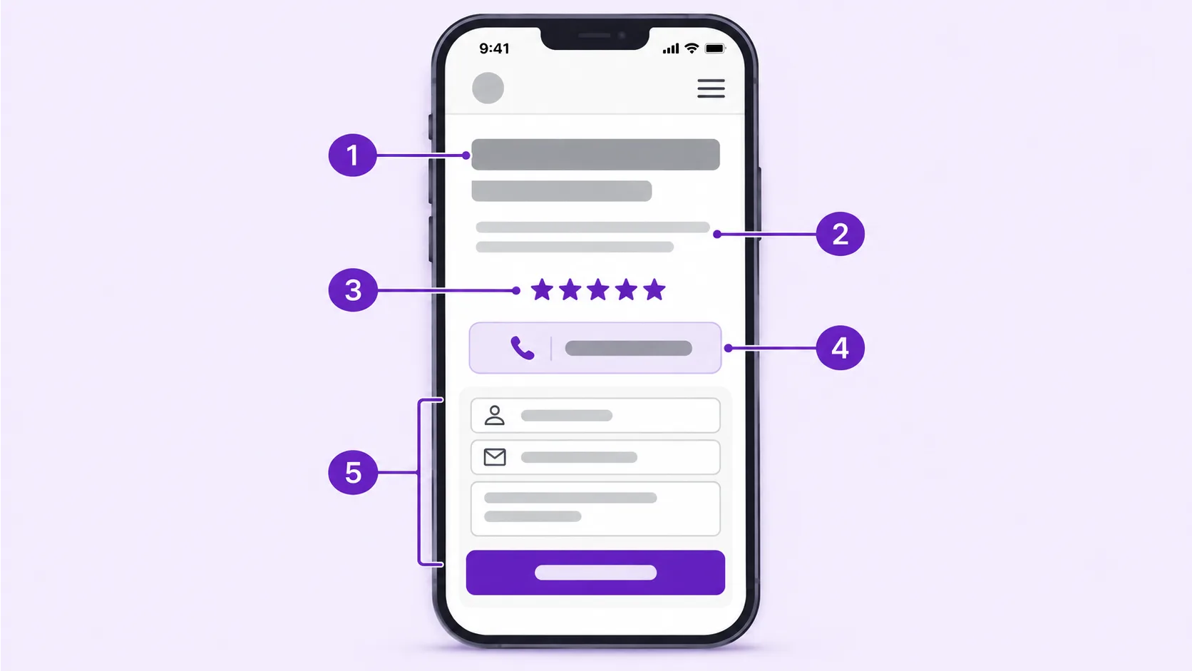
On our paid-traffic templates, the first mobile screen holds five things:
- A headline that repeats the ad.
- A one-line subhead with the main benefit, price anchor or turnaround time.
- The primary button, or the first step of the form.
- One proof element: a star rating, a client count or a guarantee.
- A tap-to-call button for service businesses.
What doesn't belong there is a full-width stock photo that pushes the offer below the scroll. On page after page I review, the hero image is both the slowest asset and the least useful one. The same logic applies to autoplay video, which we unpack in 8 reasons not to put a video in your website hero section.
3. Remove Every Exit That Isn't a Conversion
A PPC page is not the place for your full navigation, blog links or social icons. Each link is a door out of a visit you paid for.
Google counts this as well. Its description of landing page experience includes ease of navigation, the number of links on the page and whether the page meets the expectations set by the ad.
Our paid-traffic template ships with the logo (not linked), the call to action, the phone number and a minimal footer with the privacy policy and business details. Nothing else.
One goal per page matters for the same reason. Give visitors two equally weighted buttons and you split their attention, which we explain in why too many options on your website cost you sales.
4. Write for Scanners, at a 5th to 7th Grade Reading Level
Unbounce's Conversion Benchmark Report, built on more than 41,000 landing pages and 57 million conversions, found a median conversion rate of 6.6% across industries. The same data showed that copy written at a fifth-to-seventh grade reading level converted at 11.1%, more than double the 5.3% of professional-level copy.
Plain writing isn't dumbing down. It respects someone reading on a phone between two other tasks.
- Short sentences, one idea each.
- Benefits in the visitor's own words, taken from search terms and sales calls.
- Bullet points for features instead of paragraphs.
- A sans-serif body font at 16px or larger, with enough line height to scan.
Length depends on the offer. A free quote needs less persuasion than a $5,000 retainer, and we compare both formats in long-form vs short-form landing pages.
5. Build a Visual Hierarchy That Points at One Button
Every element on the page should lead the eye to the call to action: headline, supporting line, proof, button.
Size, contrast and spacing do that work. The button should be the highest-contrast element on screen, with enough empty space around it that nothing competes. On a PPC page, white space isn't wasted space. It's what makes the button obvious.
Contrast also has a minimum. WCAG 2.2 requires normal text to reach a 4.5:1 contrast ratio against its background, and 3:1 for large text. Light grey text on white can look elegant in a mockup and still fail real visitors reading in sunlight.
It's also the most common mistake on the web. The 2026 WebAIM Million scan of the top one million home pages found low-contrast text on 83.9% of them, up from 79.1% a year earlier, with an average of 34 low-contrast instances per page. On a paid page, every one of those is a sentence some visitors can't read.
On button color, I'd rather a client test than argue. Our post on how button colors influence CTA clicks explains why contrast with the page matters more than any single "best" color, and CTA placement tips that boost conversions covers where buttons perform best.
Small, purposeful motion helps too: a button that responds on hover or tap, or a form field that confirms a valid entry. Keep it functional. Animation that delays content or shifts the layout costs more than it gives.
A Page That Points at One Button Starts in the Design
Vareweb's UI/UX team designs interfaces that guide visitors toward the action you want, with usability testing and accessibility standards built into the process.
6. Make the Phone Number and Buttons Easy to Tap
For local service businesses, a phone call is often the most valuable conversion. I still see phone numbers as plain text on mobile landing pages every month.
- Wrap every phone number in a tel: link so it dials with one tap.
- Use a call-tracking number so calls from the page show up as conversions in Google Ads.
- Make tap targets comfortable. WCAG 2.2 sets a minimum target size of 24 by 24 CSS pixels. We design primary buttons far larger, usually full width on mobile.
- Add a sticky call or CTA bar on mobile, so the action is always one tap away, and check that it never covers form fields.
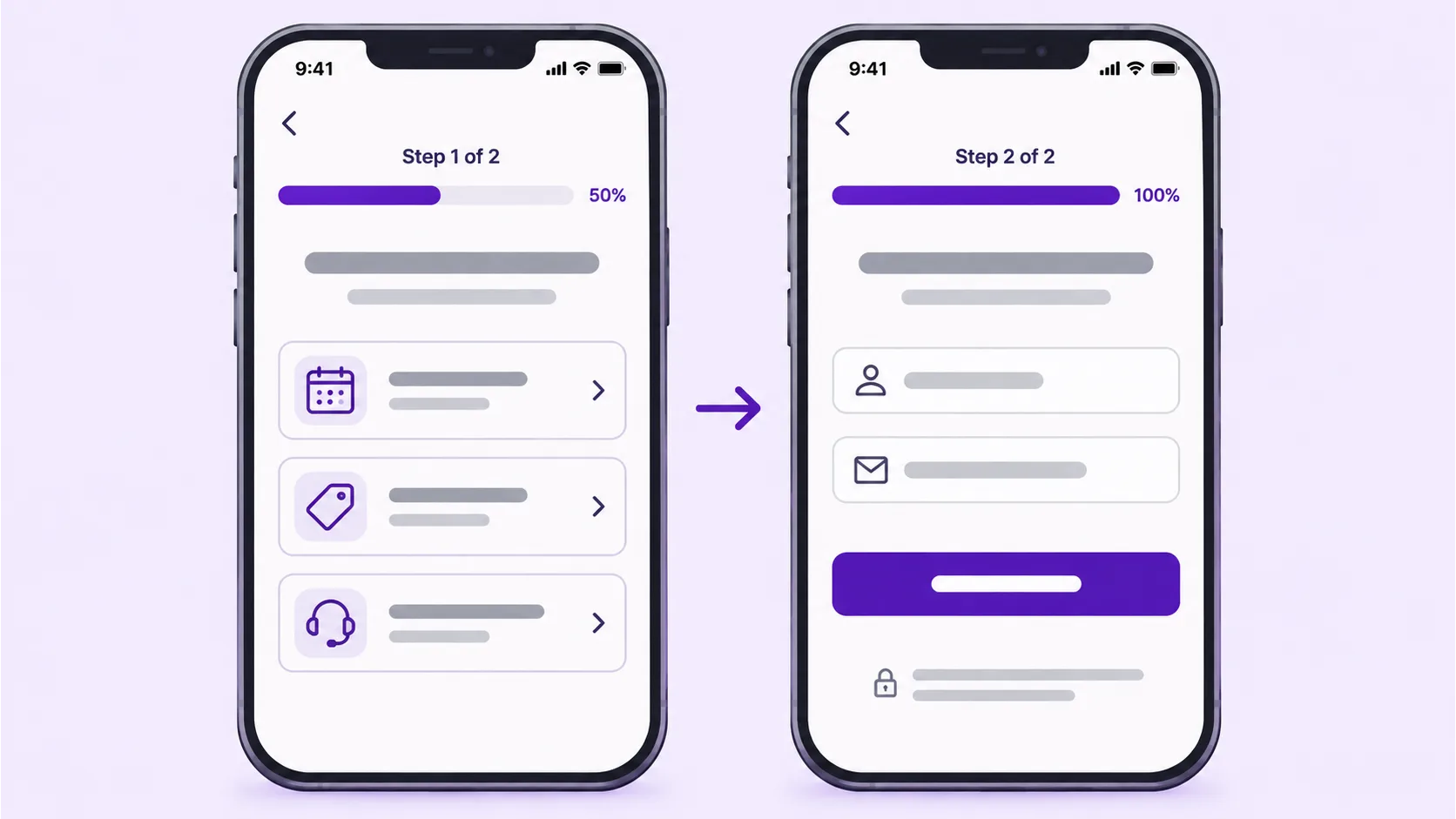
7. Shorten the Form, or Split It Into Two Steps
Every field is a question the visitor has to decide to answer. Ask only for what sales needs for the first conversation.
For most lead-generation pages we start with a name, an email or phone number, and one qualifying question. When the business genuinely needs more, a two-step form beats one long form: the first step asks something easy, like the service needed, and the contact fields come second.
- Labels above fields, not placeholder text that disappears as people type.
- The right mobile keyboard for each field (type="tel", type="email").
- Inline error messages that say exactly what to fix.
- A button that names the outcome: "Get My Quote" beats "Submit."
Our guide on how to design forms that get completed goes field by field.
8. Load the Main Content in Under 2.5 Seconds on a Phone
Speed is where my team spends most of its time on PPC builds, because it's where most pages fail.
Google's Core Web Vitals set the targets: Largest Contentful Paint of 2.5 seconds or less, Interaction to Next Paint of 200 milliseconds or less, and Cumulative Layout Shift of 0.1 or less, measured across real visits.
Most of the web still misses them. The 2025 Web Almanac performance chapter, published in January 2026, found that only 48% of mobile websites pass all three, and loading is the weakest link: just 62% of mobile sites reach a good Largest Contentful Paint. Google's ad policies also treat destinations that don't load quickly on popular browsers and devices as a poor experience.
What we do on every paid-traffic page:
- Build it in clean code or a lean template, not a multipurpose theme with a page builder.
- Serve the hero image in WebP or AVIF at the exact size it displays, and preload it.
- Lazy-load everything below the fold.
- Load chat widgets, heatmaps and extra pixels after the main content.
- Reserve space for images and embeds so nothing jumps while the page loads.
- Test in PageSpeed Insights on mobile settings, then confirm with field data once traffic arrives.
My colleague Kashaf, Vareweb's SEO Manager, explains how the same metrics affect organic rankings in his post on how important page speed is for SEO in 2026.
Slow on Mobile Means Paying for Clicks You Never Get
Vareweb builds mobile-first, responsive pages designed to load fast on any device, so the visitor your ad paid for sees the offer before they bounce.
9. Use Real Visuals That Show the Outcome
Images on a PPC page should prove something: the finished kitchen, the dashboard, the crew that shows up, the before and after.
Generic stock photos do the opposite. Visitors have seen the same smiling handshake on a dozen other sites, and it quietly lowers trust. We weigh the trade-off in stock photos vs custom photos.
A short visual story works better than a feature list. Show the problem, the result and the person who got it, in an order a visitor can follow in a few seconds of scrolling.
Keep every image compressed and sized for its slot. A beautiful 3 MB hero is still a slow page.
10. Keep the Ad, the Page and the Brand Consistent
A visitor clicks a bright, modern ad and lands on a page that looks like it belongs to a different company. That moment of doubt costs conversions.
Use the same colors, fonts, image style and tone across the ad creative, the landing page and the follow-up emails. Color can steer attention, but only inside your brand system. A random orange button that clashes with everything else looks like a mistake, not an invitation.
We break down how small inconsistencies erode trust in why consistency matters in web design.
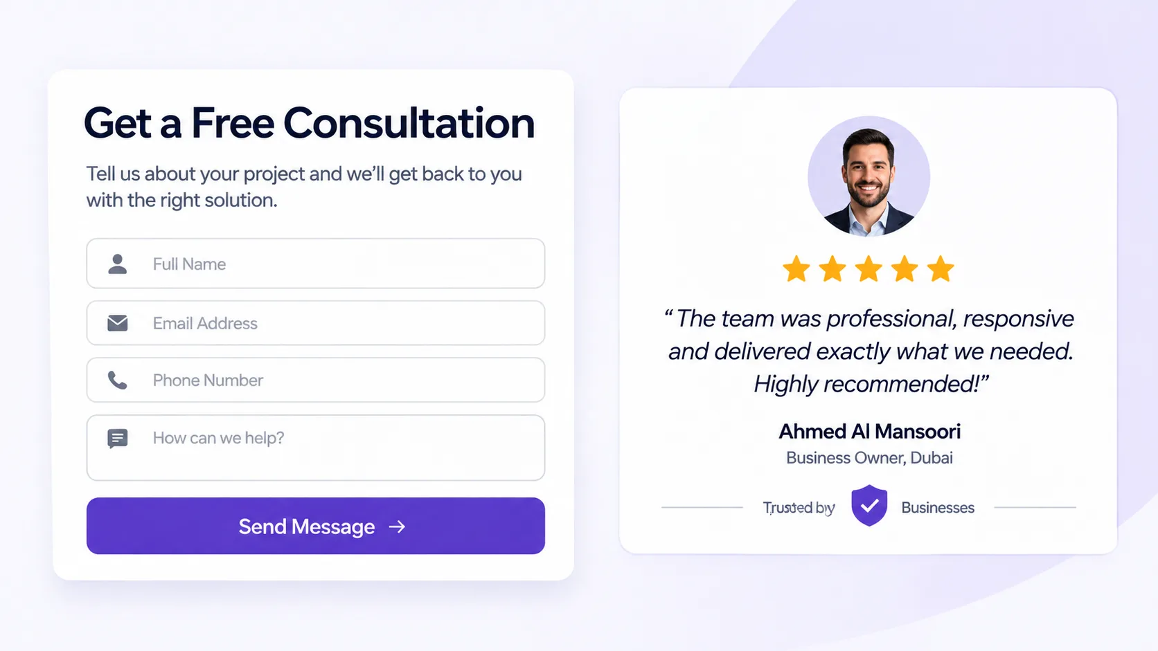
11. Put Proof Next to the Decision
Testimonials in the footer don't do much. Proof works when it sits next to the moment of doubt, which is the form or the button.
- A star rating and review count near the call to action.
- One short testimonial with a name, photo and a specific result.
- Security and payment badges near any payment fields.
- Your guarantee or response time directly under the button.
- A link to a full case study for high-ticket offers.
Our posts on what trust badges mean and why case study pages convert so well cover which proof works for which audience.
12. Track Every Conversion, Then Test One Change at a Time
A landing page without conversion tracking is a guess. Before any page goes live, we set up:
- Google Ads conversion actions for form submissions and calls from the page.
- GA4 events for form starts, form submissions and button clicks.
- Session recordings and heatmaps with a tool like Microsoft Clarity, to see where people stall.
Then we test one thing at a time: the headline, the form length, the button copy or the proof element. Change five things at once and you'll never know which one worked.
Google itself suggests using conversion rate as a proxy for landing page experience when you optimize. It's the number that pays the bills anyway. For what to watch after launch, see things to track in the first 30 days after launching a website.
The page is only half the job. If leads wait hours for a reply, the page did its part and the follow-up lost the deal. Kashaf covers that side in why automated follow-up matters more in 2026.
Google Ads Rules Your Landing Page Has to Follow
Some landing page problems don't just lower conversions. They get ads disapproved. Google's Destination requirements policy exists to make sure the page behind every ad is functional, useful and easy to navigate.
Check these before launch:
- The page loads and works on every device and in every region you target.
- Google Ads can crawl it. Don't block AdsBot in robots.txt or hide the offer behind a login.
- The final URL and any tracking template lead to the same content.
- No pop-ups that cover the page on arrival, no misleading click areas and no automatic downloads.
- HTTPS with a valid certificate on every version of the URL.
- Claims like "best" or "#1" are backed by proof on the page.
AI Max: Your Landing Page Now Writes Your Ads
This is the change most advertisers haven't caught up with yet.
Google launched AI Max for Search in May 2025. With text customization on, it uses your landing page copy, along with your existing ads and assets, to generate headlines and descriptions for specific searches. With final URL expansion on, Google may also send the click to a different, more relevant page on your domain instead of the one you chose.
It's becoming the default. Google began auto-upgrading campaigns that use automatically created assets and the campaign-level broad match setting to AI Max in September 2026, and Dynamic Search Ads follow from February 2027. Google says AI Max campaigns see an average of 7% more conversions or conversion value at a similar CPA or ROAS when the full feature set is on, based on its own data.
For landing pages, that changes the brief:
- Write page copy you'd be happy to see in an ad. Vague claims and filler on the page can end up in your headlines.
- Give every page a clear, specific HTML title and H1. Google's own guidance says AI Max works best on sites with well-written page titles and clearly written content.
- Exclude pages that shouldn't receive paid traffic, such as careers, blog posts and thin location pages, with URL exclusions.
- Check the landing pages report to see which URLs Google picked, and whether they convert as well as the page you built.
Quick Comparison: Where to Build Your PPC Landing Pages
| Option | Best for | Watch out for |
|---|---|---|
| Landing page builders (Unbounce, Instapage) | Fast launches and built-in A/B testing run by a marketing team | Monthly fees, template weight, pages living outside your main site |
| GoHighLevel funnels | Local service businesses that want pages, forms, CRM and follow-up in one place | Default templates are heavy, so speed needs deliberate work |
| Custom-coded on your own site | Brands spending steadily on ads that need speed, tracking control and brand consistency | Higher upfront build cost and a developer for structural changes |
There isn't one right answer. For clients already running their CRM in GoHighLevel, we often build the landing page and the follow-up automation in the same account, so leads route and get a reply instantly. When speed and brand control matter most, we hand-code the page on the main site. Our GoHighLevel automation and custom web design teams handle both, and our post on using AI in sales funnel optimization shows what happens after the click.
Need Landing Pages and Lead Follow-Up That Work Together?
Vareweb builds GoHighLevel funnels and landing pages connected to CRM workflows, so every lead from your ads gets captured and followed up on without anyone chasing it by hand.
PPC Landing Page Checklist Before You Spend Another Dollar
- The headline repeats the ad's keyword and offer.
- Offer, proof and call to action are visible on the first mobile screen.
- No site navigation or unrelated links.
- One primary call to action, repeated down the page.
- The form has five fields or fewer, with visible labels and the right mobile keyboards.
- Every phone number is a tap-to-call link with call tracking.
- Largest Contentful Paint is under 2.5 seconds on mobile in PageSpeed Insights.
- Text contrast is at least 4.5:1 and buttons are easy to tap.
- Images are real, compressed and sized for their slots.
- Reviews or results sit next to the form.
- Conversion actions fire in Google Ads and GA4.
- The thank-you page or message tells people what happens next.
If your page fails three or more of these, fix the page before you raise the budget.
FAQs
What is a good conversion rate for a PPC landing page?
Benchmarks are a starting point, not a target. WordStream's 2026 search benchmarks put the median conversion rate at 8.18% across 23 industries, and Unbounce's landing page data shows a 6.6% median. Your real target depends on your industry, offer and traffic quality.
Does Google AI Max change how I should build landing pages?
Yes. With text customization and final URL expansion on, Google can write ad headlines from your landing page copy and send clicks to other pages on your domain. Clear page titles, specific copy and URL exclusions now matter more than before.
How many landing pages do I need for Google Ads?
Ideally one per ad group or search intent. A plumber advertising drain cleaning and water heater repair needs two pages, not one generic services page.
Should a PPC landing page have navigation?
Usually not. Remove the main menu and keep only the logo, the call to action, the phone number and legal links, so visitors focus on one action.
Does the landing page affect my cost per click?
Yes, indirectly. Landing page experience is one of the three Quality Score components, and the signals behind it feed into Ad Rank, which shapes what you pay for a position.
How fast should a PPC landing page load?
Aim for a Largest Contentful Paint of 2.5 seconds or less on mobile, with Interaction to Next Paint under 200 milliseconds and Cumulative Layout Shift under 0.1.
Should my PPC landing page be long or short?
Short pages suit simple, low-commitment offers like a free quote. Longer pages work for expensive or complex offers, where people need more proof before they act.
Can I use my homepage as a PPC landing page?
Only for brand searches. For service or product keywords, a dedicated page that matches the ad converts better because it removes everything unrelated to the search.
Ready to Turn Paid Clicks Into Leads?
Book a free call and Vareweb will look at your current landing page, point out what's costing you leads, and map out what to fix first.

Written by
Minhaj
Minhaj Ahmed is an experienced web and software development professional specializing in web applications, mobile apps, SaaS platforms, and AI-powered solutions. As Head of Development at Vareweb, he brings a strong software engineering background to building scalable digital products and automation systems. He writes about web development, mobile apps, AI, software engineering, and emerging technologies.