Quick Answer: A good dental website needs to do more than look professional. It should load quickly on mobile, make appointment booking simple, build trust through real photos and patient reviews, and support visibility in both traditional search and AI-powered answers. While dental website guides often recommend dozens of different tactics, the most important principles consistently come back to usability, trust, local visibility, clear patient journeys, and conversion. These 15 essentials focus on the elements that can help turn website visitors into booked patients rather than adding features simply for the sake of design.
In my audits, the dental websites that book more patients all share a few traits, and none of them are about which font looks most "premium." They're fast, they make booking obvious within two taps, and they answer the anxious questions a patient has before they'll pick up the phone - does this look trustworthy, do they take my insurance, will it hurt. Everything else is decoration.
I've seen practices meaningfully increase new-patient bookings without changing their ad budget at all, just by redesigning the homepage and booking flow. That's worth sitting with, because the demand problem most practices think they have often isn't a demand problem. The ADA Health Policy Institute's Q2 2026 economic report found roughly a quarter of dentists still say they aren't busy enough - even as national dental spending keeps climbing. The patients exist. The gap is usually what happens between someone searching "dentist near me" and actually getting a name on the schedule, and a website is either the bridge across that gap or the reason it doesn't close - which is exactly the territory Healthcare SEO is built to close, alongside the design decisions covered below.
Is Booking Actually Two Taps Away on Your Site?
Most practice websites lose patients between "interested" and "booked" - not from lack of demand, but from friction nobody's measured. Vareweb builds booking flows that get out of the patient's way.
What Makes a Dental Website "High Performing" in 2026
The best dental sites I audit share measurable traits that predict patient volume far better than any visual trend does. Here's the quick-reference version before the 15 tips in detail:
| Trait | Target | Why It Matters |
|---|---|---|
| Mobile Load Time | Under 2–3 seconds | Anxious, impatient visitors can leave quickly when pages are slow to load. |
| Booking Access | Visible within two taps from any page | Removes unnecessary friction at the exact moment a patient is ready to book. |
| Service Pages | One dedicated page per major treatment | Supports local SEO while giving patients detailed information about each treatment. |
| Photography | Real team and clinic photos instead of generic stock images | Helps patients see the actual people and environment they can expect before visiting. |
| Reviews | Recent reviews displayed directly on the website | Provides visible social proof and helps answer the patient's question: “Can I trust this dentist?” |
| Local SEO | Complete schema and consistent NAP information | Helps search engines understand the practice and improves its ability to appear in relevant local searches. |
15 Dental Website Design Tips
1. Make Your Homepage Answer "Who, Where, What, and How to Book" in One Screen
What it is: Above the fold, a visitor should know who you are, what you do, where you're located, and how to book - without scrolling.
Why it matters: A patient deciding between three open tabs gives you seconds, not minutes. If they have to hunt for your city or your phone number, they've already opened a competitor's tab.
How to implement it: Include your practice name plus city plus primary service, a visible phone number, a "Book Appointment" button, and at least one trust element - a rating, years in practice, an accreditation badge - all in the same screen.
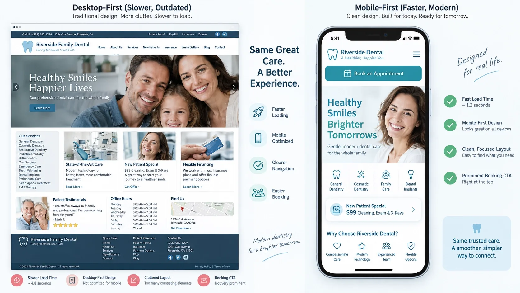
2. Design Mobile-First and Aim for Sub-3-Second Load Times
What it is: Building the mobile layout as the primary design, not a shrunk-down version of desktop, with load time as a hard constraint, not an afterthought.
Why it matters: Most dental searches happen on mobile, and Google indexes based on the mobile version of your site, not desktop. Slow pages lose anxious visitors and hurt your rankings at the same time.
How to implement it: Compress images to modern formats, clean up unnecessary plugins, use hosting built for the traffic you actually get, and test on a real mid-tier phone, not just a new iPhone on office wifi. I go deeper on what actually moves this number in How Important Is Page Speed for SEO in 2026? and Mobile-Friendly Design Best Practices for Improving Conversions and Better UX.
3. Make Booking Visible and Friction-Free on Every Page
What it is: Booking and calling visible without scrolling on every key page - patients shouldn't have to hunt for how to schedule.
Why it matters: The gap between "interested" and "booked" is where most practices lose patients, and it's almost always a friction problem, not a demand problem.
How to implement it: Use a persistent "Book Now" button, tap-to-call phone numbers, a sticky mobile header with call and booking options, and a simple four-to-six-field booking form - anything longer starts losing people. Online scheduling should connect to your practice management system where possible, and handle patient data with the same care as the rest of your HIPAA-aware processes. I cover the broader form-design principles behind this in How to Design Forms That Get Completed.
Is Booking Actually Two Taps Away on Your Site?
Most practice websites lose patients between "interested" and "booked" - not from lack of demand, but from friction nobody's measured. Vareweb builds booking flows that get out of the patient's way.
4. Keep Navigation Simple and Patient-Friendly
What it is: A small set of core sections - Home, Services, About/Team, New Patients, Reviews, Contact - with no jargon and no mystery-meat labels.
Why it matters: Patients aren't browsing your site for fun. They're trying to answer one or two questions fast, and every extra menu item is a place they can get lost or give up.
How to implement it: Limit top-level menu items to five to seven, use patient language - "Dental Implants," "Braces," "Emergency Dentist" - not internal department names, and push specific treatments into submenus rather than the top bar. This is fundamentally a site-architecture decision, and I go deeper on why it compounds over time in Why Website Structure Matters for SEO and User Retention.
5. Build Dedicated Local Service Pages for Each Major Treatment
What it is: A specific page for "Dental Implants in [City]" or "Emergency Dentist in [City]" instead of one generic Services page trying to cover everything.
Why it matters: Specific, local pages convert better because a patient researching implants feels informed enough to book after reading one, and they support local search in a way a generic services list never will.
How to implement it: Each service page should explain what the treatment is, who it's for, what to expect, a general pricing range, and testimonials specific to that treatment, not generic ones. I've laid out the technical side of building pages that actually rank locally in How to Build SEO-Friendly Location Pages That Actually Rank.
6. Use Real Photography of Your Team and Clinic - No Generic Stock
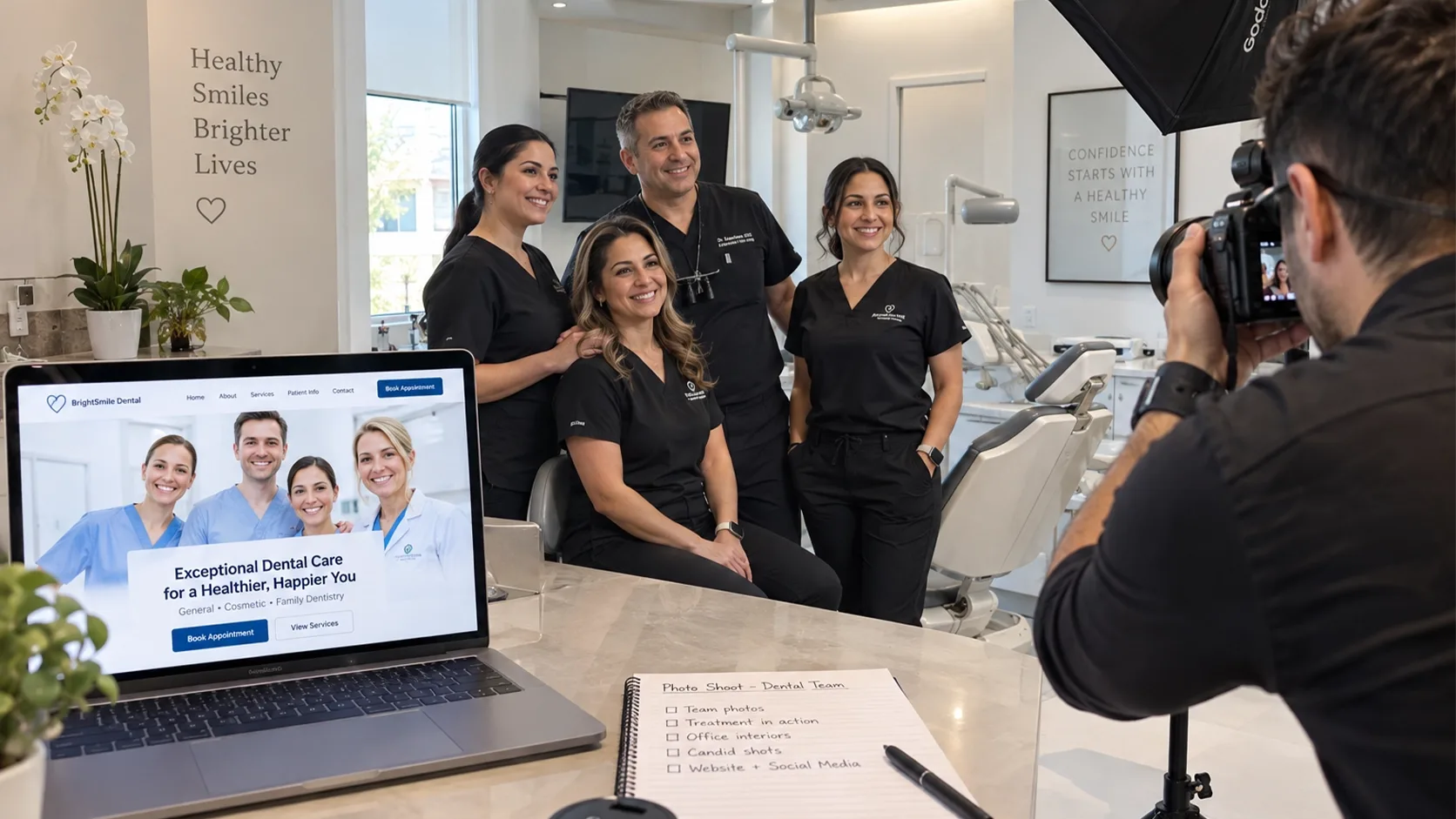
What it is: Actual photos of the dentist, the team, the reception area, and treatment rooms - not a stock photo of a model in a white coat that's on four other dental sites in your city.
Why it matters: Patients spot stock photography instantly, and it works against you in a category where trust and reduced anxiety are the entire sale.
How to implement it: Schedule a real photo session covering the dentist, the team, the space, and happy patients with consent. Keep the tone professional but warm - balance clinical cleanliness with approachability rather than looking sterile. I go deeper on why this specific trade-off matters in Stock Photos vs Custom Photos: Which Builds Trust Faster.
7. Put Reviews, Testimonials, and Before/After Photos Where They Matter Most
What it is: Genuine social proof - ratings, written reviews, photo and video testimonials - placed on the homepage and on the specific treatment pages they're relevant to, not buried on a separate testimonials page.
Why it matters: Reviews directly answer the two fears every new patient has: will it hurt, and can I trust this person. A five-star rating sitting only on your Google Business Profile does nothing for someone already on your site.
How to implement it: Embed your Google rating and a rotating set of recent reviews on the homepage and each major service page. Use HIPAA-compliant before/after galleries with clear, documented patient permission. I cover how to build the visible trust signals that actually get noticed in What Trust Badges Mean and Why They Are Important.
8. Be Transparent About Insurance, Pricing, and Payment Options
What it is: A clear, dedicated page listing accepted insurance plans, membership or discount options, and realistic "starting at" price ranges.
Why it matters: Plenty of patients won't call at all until they know whether you take their insurance or roughly what something costs - silence on this page just means silent bounces.
How to implement it: Build an Insurance & Financing page and link it clearly from your homepage and your booking flow, not three clicks deep in a footer menu nobody scrolls to.
Patients Are Searching Before They Ever Call
If your practice isn't visible for "dentist near me" and the specific treatments you offer, none of these design fixes get a chance to work. Vareweb's Healthcare SEO work makes sure the right patients find the site in the first place.
9. Design New Patient and Existing Patient Paths Separately
What it is: Two distinct booking paths - "New Patient Appointment" and "Existing Patient Appointment" - rather than one generic booking button trying to serve both.
Why it matters: New patients need guidance and reassurance. Existing patients want speed. Forcing both through the same flow underserves one of them every time.
How to implement it: Offer digital new-patient forms and "What to Expect" content on the new-patient path specifically, and keep the existing-patient path as short as it can possibly be.
10. Make Emergency and After-Hours Care Obvious
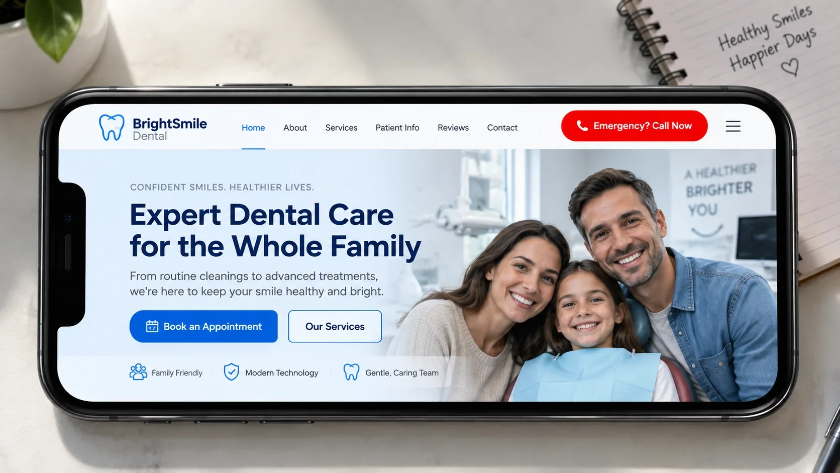
What it is: A dedicated Emergency page with clear instructions, availability, and a prominent call button - visible from the homepage, not hidden in a menu.
Why it matters: A dental emergency is high-anxiety and time-sensitive by definition. A patient in pain will not patiently navigate your site structure to find help.
How to implement it: Mark emergency availability directly on the homepage, and consider an after-hours booking widget or messaging option with clear, honest expectations about response time.
11. Write Patient-First Content in Plain Language, With Strong FAQs
What it is: Procedure descriptions written at roughly an eighth-grade reading level, focused on what patients actually worry about - pain, time, recovery, cost - rather than clinical terminology.
Why it matters: Jargon reads as distance, not expertise, to a nervous patient. Plain language that anticipates real concerns builds more trust than technical precision does.
How to implement it: Add an FAQ section to every major service page addressing the specific worries tied to that treatment. This helps patients directly and gives AI search engines and Google clean, extractable answers to cite. I go deeper on writing for readers who scan rather than read in How to Design Websites for People Who Hate Reading.
12. Make the Site Accessible and Inclusive
What it is: Readable fonts, sufficient contrast, meaningful alt text, keyboard navigation, and a logical heading structure, following WCAG accessibility guidelines at a baseline level.
Why it matters: Dental patients skew older on average and include people with disabilities more often than most retail categories. Accessibility here is both an ethical baseline and a real share of your addressable patients.
How to implement it: Run an accessibility checker, then prioritize fixes on menus, forms, buttons, and any video content - the elements patients actually have to interact with to book.
13. Implement Local SEO and Dentist Schema Markup
What it is: Dentist or LocalBusiness structured data on your homepage and location pages, carrying name, address, phone, hours, insurance, and service area in a machine-readable format.
Why it matters: Schema is how Google and AI-driven search actually understand what your practice is and where it operates, rather than inferring it from prose.
How to implement it: Keep your name, address, and phone number identical across your site and your Google Business Profile, embed reviews consistently, and use local keywords - city and suburb names - naturally in headings and copy rather than stuffed in. I've covered the template-level implementation details in How Schema Markup and Web Design Work Together, and this is precisely the layer Local SEO work is meant to own on an ongoing basis, not a one-time setup task.
Schema Is How Google Knows You're a Real Practice
Consistent NAP data and Dentist schema markup are the machine-readable layer search engines and AI answers actually read — not something a generic template handles by default. Vareweb builds this in from the start.
14. Set Up Analytics and Conversion Tracking Before You "Optimize"
What it is: Form submissions, booking completions, and click-to-call events tracked in GA4 before making design changes based on guesses.
Why it matters: You can't improve what you don't measure, and "the site looks better now" is not the same claim as "more patients booked this month."
How to implement it: Monitor conversion rate per page and cost per lead - high-intent dental pages often perform in the 5-10% conversion range when the fundamentals are right - and use call tracking to see which specific pages actually drive phone calls. This is the same discipline behind web analytics done properly, applied to a practice's specific booking funnel.
15. Treat Your Site as a Living Asset - Update Quarterly, Refresh Every Few Years
What it is: A standing habit of reviewing photos, testimonials, service details, pricing, hours, and insurance information at least quarterly, plus a full design refresh roughly every two to three years.
Why it matters: Outdated information - an old associate still listed, an insurance plan you dropped two years ago - quietly erodes trust every time a patient notices it, even if they never mention it.
How to implement it: Put a recurring quarterly review on the calendar rather than waiting for something to visibly break, and plan for a genuine redesign cycle rather than letting the site drift for a decade.
Before/After Pattern From Real Dental Redesigns
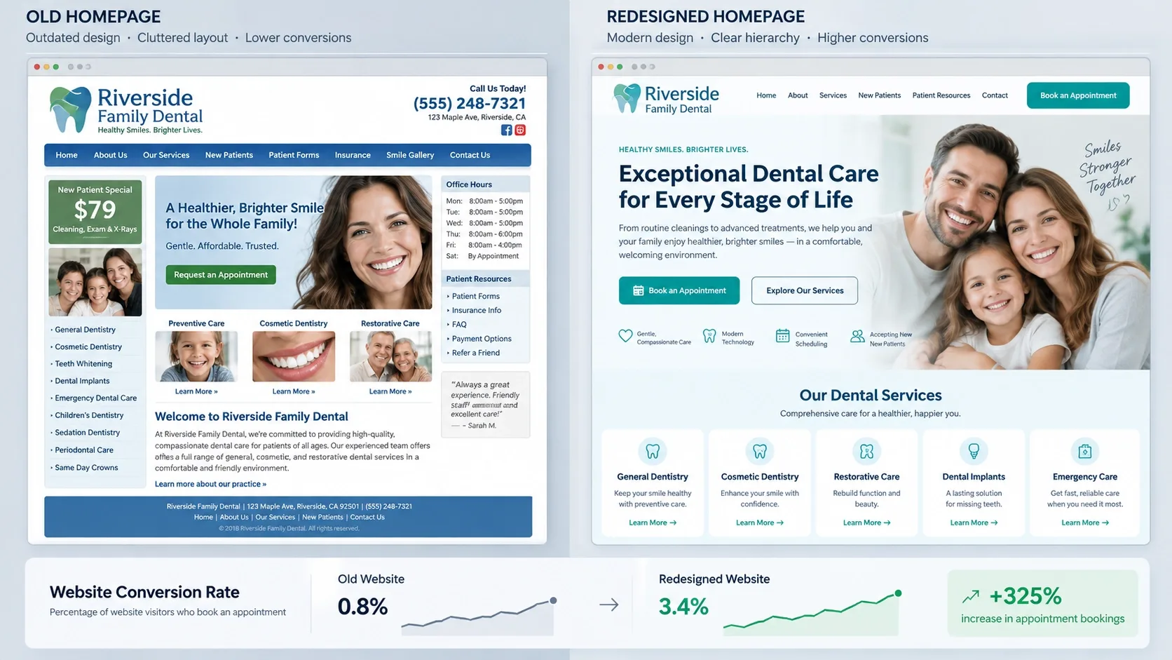
A realistic pattern, not a specific client claim: before, a slow, desktop-first site with a generic homepage, no clear booking button, a handful of thin service pages, mostly stock photography, and reviews that live only on the Google Business Profile, disconnected from the site itself.
After, the same practice runs a mobile-first site with a clear hero section carrying a "Book Appointment" button and tap-to-call, dedicated service pages for each major treatment, real photography throughout, embedded reviews on the pages that matter, a genuinely simple booking flow, and tracking actually in place to measure any of it.
Described directionally rather than with invented precision: conversion rate typically moves from a low single-digit rate to a high single-digit one. New-patient bookings increase without a corresponding jump in ad spend. And front-desk staff usually report fewer calls asking basic information - hours, location, insurance - and more calls from people who are already ready to book.
How to Measure Whether Your Dental Website Design Is Working
Track monthly: new-patient bookings by source, conversion rate by key page, organic traffic per service page, and Core Web Vitals scores. Concentrate improvement effort on the pages carrying the most weight - homepage, implants, orthodontics, emergency, and new patients - rather than spreading attention evenly across the whole site.
Run a simple, repeatable cycle: fix speed, fix mobile, simplify booking, strengthen social proof, improve content, then measure again before starting the next round. Treating this as a one-time project rather than a cycle is the single most common reason a redesign's gains fade within a year.
Ready for a Website That Actually Books Patients?
Vareweb builds fast, mobile-first practice websites - clear booking flows, real photography, local SEO - engineered around getting a name on the schedule, not just looking professional. One team, accountable for the whole result.
Practical Checklist
☐ Does your homepage answer who you are, what you offer, where you are, and how to book - above the fold?
☐ Is your website fast and mobile-first, with tap-to-call and booking visible on every key page?
☐ Do you have dedicated, locally-optimized service pages for your main treatments?
☐ Are you using real photos of your team and clinic instead of stock?
☐ Are reviews and testimonials embedded on the homepage and service pages?
☐ Is insurance and pricing information easy to find and understand?
☐ Do new and existing patients have clearly labeled, separate booking paths?
☐ Is emergency and after-hours information obvious from the homepage?
☐ Is your content written in patient language with strong, specific FAQ sections?
☐ Does your site meet basic accessibility standards - contrast, alt text, keyboard navigation?
☐ Have you implemented local SEO and Dentist or LocalBusiness schema?
☐ Is conversion tracking set up for forms, calls, and bookings?
☐ Do you review and update your site at least quarterly?
FAQs
How many pages should a dental website have?
Enough for a dedicated page per major treatment plus core pages - home, about, new patients, reviews, contact. A small general practice might run 10-15 pages; a multi-specialty clinic more.
Does my practice really need online booking?
Yes, or at minimum tap-to-call and a simple form - see Tip 3. A meaningful share of interested patients won't pick up the phone as their first step anymore.
Are video testimonials worth the effort?
They're a strong addition where you already have a base of written reviews and photos - see Tip 7 - but they're not a substitute for those fundamentals if you don't have them yet.
How detailed should my treatment pages be?
Detailed enough that a patient feels informed enough to book - what the treatment is, who it's for, what to expect, and a rough cost range, per Tip 5. Padding for length without adding real information doesn't help.
Do I need to show prices on my dental website?
At minimum, a realistic starting range - see Tip 8. Complete silence on cost is one of the more common reasons patients quietly leave without calling.
How often should I redesign my dental site?
A full redesign roughly every two to three years, with quarterly content and photo updates in between - see Tip 15. Waiting much longer lets small outdated details accumulate into a real trust problem.
Can I rely on templates, or do I need a custom design?
A well-built template can work for the fundamentals. What usually needs custom attention is the booking flow, service-page structure, and photography - the parts of Tips 1 through 7 templates rarely get right out of the box.
What's the most important thing to fix first on a struggling dental site?
Speed and booking friction, in that order - Tips 2 and 3. Neither trust signals nor content quality matter if visitors leave before the page finishes loading or can't find how to book.
How do I know if my site is "good enough" on mobile?
Test it on an actual mid-tier phone under real conditions, not a flagship device on office wifi, and time how long it takes to reach a booking confirmation from the homepage - see Tip 2.
Should I hire a specialist or use a generic web agency?
Either can work if they understand patient psychology and healthcare-specific compliance, not just general web design - the difference shows up most in Tips 3, 8, and 13.

Written by
Minhaj
Minhaj Ahmed is an experienced web and software development professional specializing in web applications, mobile apps, SaaS platforms, and AI-powered solutions. As Head of Development at Vareweb, he brings a strong software engineering background to building scalable digital products and automation systems. He writes about web development, mobile apps, AI, software engineering, and emerging technologies.