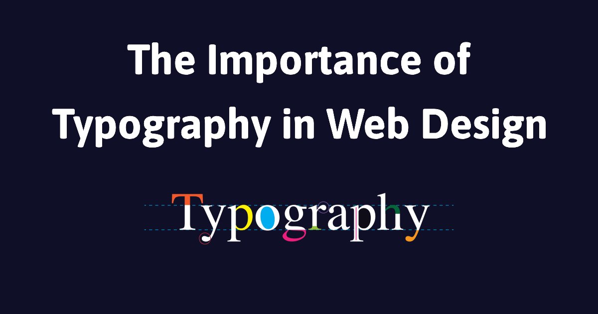
What Is Typography in Web Design?

Typography in web design is about arranging text so it looks good, is easy to read, and matches the brand’s style. It involves the thoughtful use of fonts, spacing, hierarchy, color, and alignment to create a seamless and enjoyable reading experience on the web.
More than just choosing pretty fonts, typography combines aesthetic sensibility (art), communication strategy (skill), and technical execution (craftsmanship) to ensure all website copy is clear, legible, and easy to scan.
Why Does Typography Matter in Web Design
Typography isn’t just about visuals—it’s central to how users interact with your website content. Good typography:
- Improves readability and helps users digest information faster.
- Establish a clear content hierarchy.
- Reinforces brand personality and consistency.
- Boosts user engagement and time spent on page.
- Creates emotional connections through font style and tone.
The Purpose of Typography in Web Design
In traditional print design, typography’s primary purpose was to convey information efficiently. But web design has different rules. Users don’t read web pages like books—they skim, scan, and bounce quickly if something doesn’t feel right.
This shift has redefined typography’s role:
- From pure information delivery → to user engagement
- From passive reading → to visual storytelling
- From function → to emotion and identity
Typography now captures attention, sparks interest, and guides users emotionally and cognitively through digital content.
Key Typography Elements in Web Design
To create impactful typography on websites, designers must consider several key elements:
1. Fonts and Typefaces

A font refers to a specific style and weight of a typeface (like Arial Bold 12pt), while a typeface is the broader family of fonts (like Arial).
Best Practices:
- Use no more than 2 typefaces for consistency.
- Stick with web-safe fonts for compatibility.
- Match fonts to the site’s tone and personality.
- Pair contrasting fonts strategically (e.g., serif for headings, sans-serif for body text).
- Keep font sizes readable (minimum 16px for body text).
Common Web-Safe Fonts:
| Font | Typeface | Description |
| Arial | Sans-serif | Versatile and widely supported |
| Verdana | Sans-serif | Clear, easy to read on screens |
| Tahoma | Sans-serif | Compact, modern, and crisp |
| Trebuchet MS | Sans-serif | Stylish, good for headlines |
| Times New Roman | Serif | Classic and formal |
| Georgia | Serif | Elegant and readable |
| Courier New | Monospace | Common for coding and system messages |
| Impact | Sans-serif | Bold, eye-catching |
2. White Space (Negative Space)

White space improves readability and guides the eye by:
- Separating content blocks.
- Making text feel less overwhelming.
- Enhancing visual focus.
Good use of white space makes a page feel balanced and breathable. Bad use makes it cluttered and chaotic.
3. Tracking (Letter Spacing)

Tracking is the uniform spacing between letters in a word or block of text.
- Increased tracking adds space, creating a clean look.
- Tight tracking can feel dense and hard to read.
Use it to improve legibility and influence the tone (e.g., tighter spacing feels more compact and formal).
4. Kerning

Kerning adjusts the space between individual character pairs. While tracking applies to the entire word or sentence, kerning is used to make specific letter combinations appear more natural.
Example:
- AV might look too far apart without kerning.
- Proper kerning improves visual harmony.
5. Hierarchy

Hierarchy helps users scan content and understand its importance at a glance.
Set clear distinctions between:
- Headings (H1, H2, H3…)
- Subheadings
- Body Text
- Captions or Annotations
A consistent hierarchy makes the user experience intuitive and digestible.
6. Alignment

Proper alignment ensures your content feels organized and cohesive.
Common web alignments:
- Left-aligned: Best for most Western audiences.
- Centered: For headers or callouts (use sparingly).
- Justified: Avoid on the web—it can create awkward word spacing.
7. Color and Contrast

Typography color must complement the overall design and remain readable.
High contrast (e.g., black text on white background) = better readability
Low contrast (e.g., light gray on white) = user frustration
Use color to:
- Highlight important content
- Create emotional tone
- Maintain accessibility standards
Why Is Typography Important in Web Design?
Typography is important in web design because it plays a big role in making your website easy for visitors to read and understand. It involves choosing the right fonts, spacing, and layout to ensure the text is clear and looks good. When typography is done well, it helps guide users through the website, making the content easier to follow and keeping them engaged. Simply put, good typography helps people find what they’re looking for faster and makes the site more enjoyable.
Now that you understand how the various parts of typography influence how users view a website design, let us go over the overall benefits of incorporating effective typography techniques into your web design strategies.
Vital for Making Website Content Legible
If people can’t read your content easily, they’ll leave. The font you use, the size of the text, and how much space is around it all matter. When it’s done right, everything feels easy to follow, and visitors are more likely to stay and keep reading.
Vital for Building Brand Identity
Fonts help show what your brand is about. A serious font feels different from a playful one. The way your text is styled helps people get a feel for your brand, even before they read a word. It makes everything look more put together and on-brand.
Vital for Accessibility
Not everyone experiences websites the same way. Some people have trouble seeing small or fancy fonts, and others use phones or screen readers. Using simple, readable text with enough space around it helps everyone navigate your site more easily. It’s a small thing that makes a big difference for accessibility.
Practical Strategies for Effective Typography
Here are a few easy ways to make the text on your website look good and easy to read:
1. Choose fonts that fit your brand: Pick a font that feels right for your business. If you run a modern company, use a clean, simple font. If your brand feels more classic, a traditional font might work better.
2. Use size and weight to show what matters: Make headings bigger or bolder so people can see what’s important. Keep regular text simple and easy to follow. This helps people find their way through your content without getting lost.
3. Make sure the text is easy to read: Don’t put light text on a light background or dark text on a dark one. Use strong contrast so the words stand out clearly. It makes a big difference.
4. Check how it looks on phones: Many people visit websites using their phones. Ensure your text isn’t too small or squished on smaller screens. It should still be easy to read without zooming in.
Conclusion
Typography is crucial in web design. It affects how people engage with your site, view your brand, and experience the whole website or app.
Typography significantly impacts how visitors interact with digital content, from developing an emotional connection with users through carefully chosen typefaces to guiding their attention through good visual hierarchy.
Following best practices for typography choices, readability, and accessibility, web designers may develop inclusive, user-friendly, and visually appealing websites. Typography also plays an important part in branding and marketing, helping to create a distinctive brand image and reinforce the business’s identity.
Why VareWeb
We hope this helps you understand the importance of typography in web design. Our advice comes from years of experience working with businesses like yours.
Ready to improve the typography on your website? At VareWeb, we can help you make the best font choices to elevate your design. Let’s work together to make your website both appealing and functional.
Take Your Business to the Next Level with VareWeb!
✔️ Bringing Your Ideas to Life – From custom software to powerful applications, we create solutions that work for you.
✔️ Practical & Results-Driven – Our team is dedicated to developing efficient, user-friendly, scalable technology that fulfills real-world needs.
✔️ For Startups & Enterprises – Whether you’re starting a new business or enhancing an existing one, we can help you remain ahead.
Let’s build something great together—what’s your next big move? Contact us today!
You may also like
Cultural Influences In Logo Design
The business environment has changed with the current globalization and...
Read More >>Things to Consider During a Website Review
Designing a website needs extensive research and several evaluations during...
Read More >>How to Integrate SEO Best Practices into Your Web Design Process
When creating a new web design, ensuring good SEO should...
Read More >>Ready to take the
next step?
- contact@vareweb.com
- Contact no: +1 (469) 20466-6031
- 5400 Preston Oaks Rd, Dallas, TX 75254, USA


