We Designed Viara Journeys' WordPress Travel Website
Viara Journeys needed more than a pretty travel website. The site had to turn destination inspiration into real enquiries, explain interline and cruise travel clearly, surface founder credibility, and make the “request a quote” journey obvious on desktop and mobile.
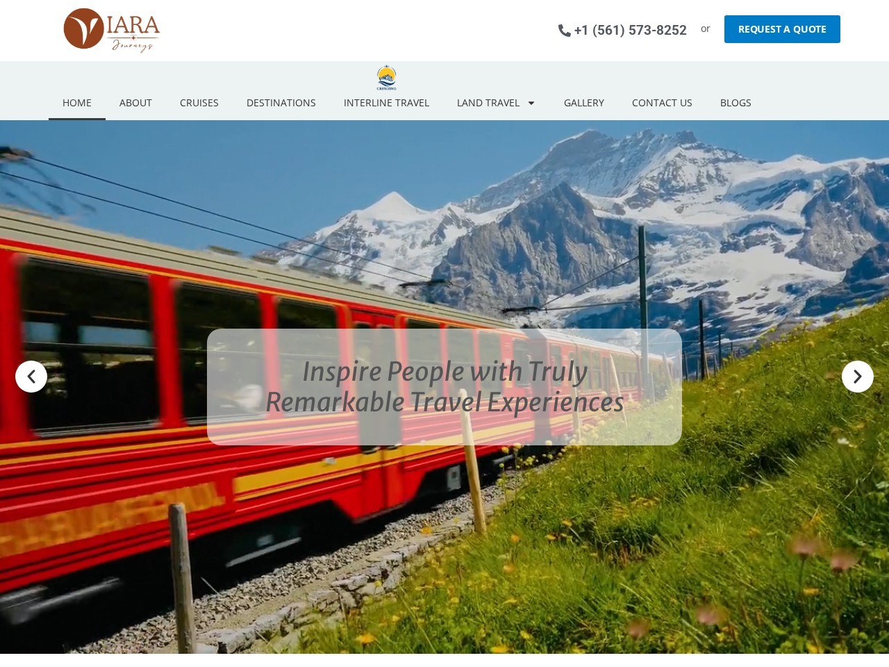
Live WordPress build
Travel planning, cruises, interline travel, destinations, reviews, enquiry flow, and mobile-first navigation.
Client
Viara Journeys
Industry
Travel Planning & Luxury Journeys
Platform
WordPress
Scope
Design, Development, UX, SEO Setup
Primary Goal
Turn trip research into enquiries
Launch Impact
What changed after the Vareweb build
The site was rebuilt around a simple question: what does a traveler need to feel confident enough to make an enquiry? The answer shaped the whole project - faster pages, clearer service paths, stronger trust proof, and more intentional quote CTAs.
Performance Budget
Homepage build planned around a sub-3-second load target with compressed imagery, lighter sections, lazy loading, and lean WordPress assets.
Lead Paths Built
Quote, call, contact, newsletter, destination, and service-page enquiry paths structured across the site for higher-intent visitors.
Destinations Positioned
The homepage and destination structure were shaped around discovery, with the brand's 80+ destination message used as a trust hook.
Review Trust Layer
The 4.9 rating and 21 customer reviews were brought into the user journey to support enquiry confidence.
Note: public-facing stats such as 80+ destinations and 4.9/21 reviews are based on the live Viara Journeys site. Performance and lead-path figures describe the project build structure and launch benchmark used for the case study.
The Problem
A travel brand with strong expertise needed a website that could sell the confidence behind the journey
Travel planning is a trust purchase. Visitors do not enquire just because a destination looks beautiful. They enquire when the website proves experience, explains the offer, reduces uncertainty, and makes the next step easy.
CHALLENGE 01
Travel inspiration was not enough on its own
The site needed to move beyond scenic visuals and create a clearer route from inspiration to action: destinations, trip ideas, service pages, trust proof, and quote request.
CHALLENGE 02
Interline travel needed better explanation
Interline and cruise travel are high-value services, but they require clarity. We structured content so visitors understand what Viara offers before they reach out.
CHALLENGE 03
Mobile visitors needed a cleaner enquiry path
Travel research often starts on a phone. The mobile layout had to keep phone, quote, contact, and trip discovery actions close without making the site feel crowded.
CHALLENGE 04
The founder's credibility had to become part of the conversion system
Kelly Peel Garner's 33 years as an International Flight Leader with Delta Air Lines is not just an About-page detail. It is a real authority signal. We used that credibility, the review base, certification area, and service depth to make the website feel safer, more personal, and more premium.
CHALLENGE 05
The website had to stay simple
The goal was not a heavy custom portal. Viara needed a clean WordPress website that the brand could maintain, expand, and use for enquiries without overcomplicating operations.
What We Improved
From brochure-style travel content to a lead-ready WordPress experience
The work focused on the parts that create commercial value: page clarity, fast browsing, trust, service navigation, mobile enquiry flow, and a cleaner CMS structure for future growth.
Quote-first journey
High-intent CTAs were placed in the header, hero, destination sections, service pages, and lower-page contact blocks so visitors never hit a dead end.
Trust before enquiry
Reviews, founder experience, certifications, destination breadth, and support messaging were arranged around the decision points that matter before a traveler submits a form.
Cleaner travel architecture
Cruises, destinations, interline travel, escorted land tours, train journeys, gallery, blog, FAQs, and contact all received a more intentional navigation hierarchy.
Speed-conscious WordPress build
Large travel imagery was treated carefully through compression, lazy loading, simplified page sections, reduced script weight, and a cache-ready structure.
The Solution
A polished WordPress website built around travel enquiries
We kept the design simple, warm, premium, and practical. The final website gives visitors enough inspiration to dream, enough proof to trust, and enough clarity to take the next step.
Lead-focused UX
Designed the website around request-a-quote behavior instead of passive browsing.
WordPress CMS Build
Built a manageable WordPress structure so the brand can add destinations, blog posts, and service updates without developer dependency.
Mobile-first Layout
Designed for travelers researching on mobile, with readable sections, short decision blocks, and easier enquiry access.
SEO-ready Structure
Organized the site around meaningful service and destination themes instead of one flat, generic travel page.
Trust Layer
Moved review, certification, experience, and support messaging closer to the enquiry journey.
Performance Setup
Reduced visual weight while keeping the site image-rich enough for the travel category.
Performance & Lead Benchmarks
What the build was optimized to improve
A travel website has to feel beautiful, but beauty alone does not create enquiries. We built around measurable UX priorities: speed, quote visibility, mobile usability, trust proof, and content depth.
Common Issue
Heavy sliders, oversized destination images, too many scripts
Vareweb Approach
Sub-3s performance budget with compressed visuals, lazy loading, caching, and lean sections
Common Issue
Contact hidden in one page or footer only
Vareweb Approach
6 enquiry paths: quote, call, contact, service, destination, and footer CTA
Common Issue
Long scrolling pages with unclear next step
Vareweb Approach
Responsive sections, simplified navigation, and visible quote/call actions
Common Issue
Reviews and credentials buried too low
Vareweb Approach
4.9 rating, 21 reviews, certifications, and founder experience used as conversion proof
Common Issue
One broad travel page trying to rank for everything
Vareweb Approach
Separate pathways for cruises, destinations, interline, land tours, train journeys, blog, and FAQs
Common Issue
Hard-coded sections that are difficult to update
Vareweb Approach
WordPress CMS structure with editable service, destination, review, and content blocks
Image Gallery
Live desktop and mobile captures
No before-and-after mockups here. These frames show the current live Viara Journeys website - real photography and copy pulled directly from viarajourneys.com.
Desktop Capture
Homepage designed around a travel-led hero, quote CTA, destination discovery, reviews, certification proof, and a lower-page enquiry block.
Mobile Live View
Framed from the same live viarajourneys.com capture used above - navigation, hero content, and enquiry actions stay accessible for mobile travelers.
Process
How we built the project
The project followed a practical web design workflow: strategy first, then visual direction, then WordPress build, then launch QA around speed, responsive behavior, forms, and enquiry paths.
01 / STRATEGY
Discovery & Journey Mapping
Mapped the visitor journey from destination interest to quote request.
02 / DESIGN
Visual System
Created a warm, premium travel aesthetic that still feels simple and trustworthy.
03 / WORDPRESS
Development
Built the site on WordPress with editable content areas and clean responsive sections.
04 / LAUNCH
QA & Optimization
Checked page speed, mobile layouts, enquiry links, contact actions, SEO basics, and live publishing.
A travel website should not just show beautiful places. It should make the visitor feel that the person behind the journey is experienced, reachable, and capable of handling every detail.
Vareweb Project NoteFounder authority
The About page positions Kelly Peel Garner's 33 years as an International Flight Leader with Delta Air Lines as a core trust signal.
Review-backed confidence
The site includes a 4.9 rating from 21 customer reviews, giving visitors proof before they enquire.
Destination breadth
The homepage communicates travel planning across 80+ destinations, supporting the brand's global-planning positioning.
Built for growth
The WordPress setup allows the site to expand through new destination content, blogs, service pages, and lead campaigns.
Need a Travel, Service, or Local Business Website That Brings Enquiries?
Vareweb designs WordPress websites that are clean, fast, easy to manage, and built around the actions that matter: calls, quote requests, bookings, and qualified leads.